2 shots for cc

matt hkd

TPF Noob!
Joined
May 15, 2011
Messages
35
Reaction score
4
Location
So Cal
Can others edit my Photos
Photos OK to edit
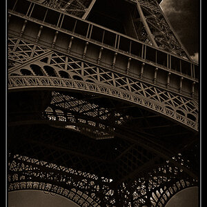
Hey guys, just wanted to get some feedback on these shots i took a few days ago. The first one I took for a shoot-from-ground-level challenge and the second is just a portrait of my girlfriend. 12
 
I too love the colors in #1. GF's face in #2 seems to have a reddish tint to it. I like the composition in both
 
photo 1 is bad ass. like the way the colors pop. photo 2 didn't really notice anything until I read cepwin comments but now that I did I too see the red tint. both pics are awesome but the colors in #1 takes the prize!
 
Thanks for the feedback guys. I'm pretty happy with how 1 came out too. I didn't notice the red at first but now that you say it I can see it. I took this in setting sunlight so maybe I didn't get the white balance right in my edit or maybe it's becuse I desaturated the green to tone down the grass, so maybe that did something too?
 
#1 is truly an outstanding picture, you got it all working in this one. I would have liked to to have seen #2 in a vertical composition.
Great pictures
 
In #1 colors are nice and the POV is good (ground -level) but the shapes mena that there is lots of dead space in the picture and what really draws the eye is confined to the center.

Why not try a more imaginative crop to tighten it up. It is the wheels we are looking at, yes?
And we know what the shows look like and they're just here for support so ................

6805520011931589ab18bll.jpg
 
Thanks for the idea traveler, but I don't like the tighter crop. I was also trying to show the wear in the shoes from skating on the board, and cropping that out would defeat that. I also like that you can see the hill in the back because that's a major part of the style of long boarding I enjoy. Sure it's out of focus and subtle, but I like having that element there.
 
I was also trying to show the wear in the shoes from skating on the board, and cropping that out would defeat that.

That's a pretty obscure point for most photographers to understand and, if that is so, then the composition has 3 centers of interest (two toes and the wheels) that are pretty much unrelated. As an informational image that might be fine but as a 'photograph' that doesn't work for me.
 
I find myself torn on this crop. I agree with The_Traveler, I see three different POIs. I'm really not sure what I'm supposed to be looking at and I find my eyes wandering. That said, I appreciate that you're trying to tell a story. I can see where you're coming from with the worn shoes, I just find it a little distracting.

I think I like the crop. It makes the wheels a lot more prominent and only one POI.
 

Most reactions

New Topics

Back
Top