Starskream666
No longer a newbie, moving up!
- Joined
- Jul 6, 2011
- Messages
- 598
- Reaction score
- 56
- Location
- England, West Yorkshire
- Can others edit my Photos
- Photos NOT OK to edit
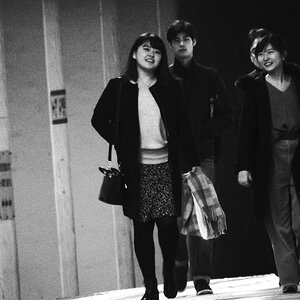
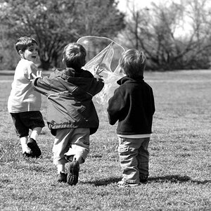
Now the style I wanted wasn't a big lighting set up with umbrellas and what not... more natural, no forced poses. I know that sort of style usually doesn't get much love on here but this is how I wanted it.


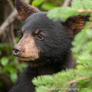
 I like the pix.
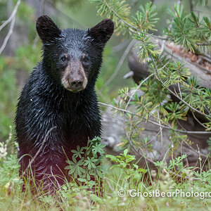
![[No title]](/data/xfmg/thumbnail/38/38262-10a9668da9a2b36a92cddde57caf87bc.jpg?1619738547)
![[No title]](/data/xfmg/thumbnail/38/38263-ad5e4c9e677626ddb5b1e7cdf9ebe40e.jpg?1619738548)

![[No title]](/data/xfmg/thumbnail/40/40286-86401b94de8b01bea8bb4ea154aaea0a.jpg?1619739408)
![[No title]](/data/xfmg/thumbnail/36/36392-ee7dc51c9be334b9979003f6316db12e.jpg?1619737547)