3 images for C&C (first timer)

nateMN

TPF Noob!
Joined
Sep 9, 2009
Messages
41
Reaction score
0
Location
Minneapolis, MN
Can others edit my Photos
Photos OK to edit
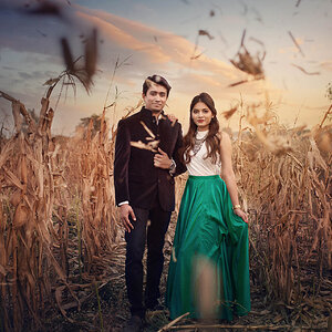
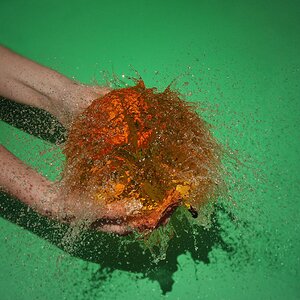
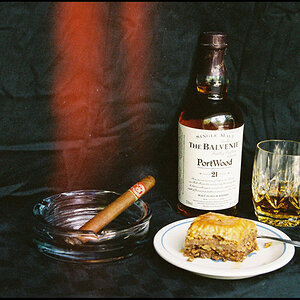
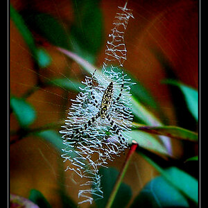
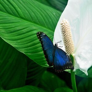
Recently made the jump into the SLR world and really enjoying it and learning a lot.
Here's a few taken over the last 2 weeks I liked. Please let me know which "4" you like better (or neither)... I couldn't decide.
1.
3905311002_8f30384867.jpg


2.
3905310306_e9ceb0f22e.jpg


3.
3904527181_b909bab1d0.jpg


4a.
3904528175_08010a920b.jpg

4b.
3904558747_078a183365.jpg
 
First time? Wow, you've got some natural talent then.

1. For the most part, I like it. I might have gone a bit lower and closer to the ball, with a shallower DOF. I think that would've added a bit of depth and urgency to the shot. In post-processing, something to always look for is lighting on faces. Even black furry ones. The light is very directional, and directly above the dog, so there are quite a few shadows on the face. Go over those spots with a subtle 'dodge' in PS, but leave them just a bit darker than the naturally lit areas. This is the post process equivalent of using a fill-flash, and if used correctly can definitely improve shots. Lastly, Something about the bokeh in the shot seems a bit weird to me... It could be that that particular aspect of your lens isn't its strong point, but I suspect there's a fair amount of sharpening going on here, whether in camera, or in Photoshop. Try to keep sharpening subtle, and if more is necessary, separate the "in focus" DOF areas from the blurred ones on a new later, and sharpen only them.

2. This is just plain a gorgeous shot. It's one that's done a lot, so there's not much 'new' there, but it's so well shot that I don't really care. If I had to nitpick, and I do ;), I'd say play around with a slight "s" shape in curves to deepen some of the darker parts, and add a bit more contrast. Here's an edited version of what I mean: I very slightly modified the curves, then took a huge burn brush at 10% for shadows, and brushed over it a couple of times. Then I took Dodge at 5% for midtones and did the same thing.
3905310306_e9ceb0f22e.jpg

It's a subtle change, but it added some variation in the water color/brightness and the sky, to make the colors appear a bit deeper and more dramatic.

3. This photo seems a bit like a well-shot snapshot to me. Don't get me wrong, it's very cute, and the DOF is nice, but the background isn't interesting enough to really cut it, or clean enough to go for a minimalist thing. If it had been all wall with no corner/door, and more central on the stairs (no bannister), it would have put all the focus on the dog, and I think would be really nice.

4. I can't really decide either. The land on the right is hardly necessary, but the tree is better positioned in the first. What bothers me, though, is the angle. The background trees go almost halfway up the subject tree, and that's distracting. I don't know for sure if this is possible given the location, but maybe going closer to the ground with a long lens would help. The longer lens (Longer in general, not necessarily longer than what was used. 75mm 35mm equivalent or more [generally around 50mm on DSLRs])would eliminate that low to the ground stylized feeling, which doesn't suit this shot all that well, but actually being low would raise the subject tree in relation to the background. The last thing I'll say is this: Circular polarizer. If there's even the slightest bit of blue in the sky, and I'm outside, my polarizer is on.

Sorry for the novel, once I get going it's hard to stop! If it seems like I'm calling out everything on your shots, don't take it in a discouraging way whatsoever. If I don't think a shot is worth critique, I won't give it, but these clearly are.
 
#1 is a great example of story telling.

:thumbup:
 
By far #3 is my favorite. It conveys a sense of longing to me that only a dogs face can show.

I like 4b as well. I might clone out the distracting elements on the far shore.

Honestly all four are pretty nice. :)
 
#3 is kewl, it looks like it was taken by a actual creative photographer.:thumbup: The other ones are nice photos but it looks like you could have been just that a reguler nice photo taken with a reguler digital camera. But #2 is kewl cuz I think your sole purpose out there was to get the shot. Ive been compelled to that. Am I correct about #2?
 
First time? Wow, you've got some natural talent then.
Thanks, I picked up Understanding Exposure and have been looking at all the great aritcles on DPS also.

1. Go over those spots with a subtle 'dodge' in PS, but leave them just a bit darker than the naturally lit areas. This is the post process equivalent of using a fill-flash, and if used correctly can definitely improve shots.
Is there an equivalent to this in lightroom2?
Lastly, Something about the bokeh in the shot seems a bit weird to me... It could be that that particular aspect of your lens isn't its strong point, but I suspect there's a fair amount of sharpening going on here, whether in camera, or in Photoshop. Try to keep sharpening subtle, and if more is necessary, separate the "in focus" DOF areas from the blurred ones on a new later, and sharpen only them.
Yes, i tried to sharpen my somewhat out of focus image in lightroom. I had a few more taken at 1.8/f and 2.2/f, but the ball was too blurry to understand the shape.

2. This is just plain a gorgeous shot. It's one that's done a lot, so there's not much 'new' there, but it's so well shot that I don't really care. If I had to nitpick, and I do ;), I'd say play around with a slight "s" shape in curves to deepen some of the darker parts, and add a bit more contrast. Here's an edited version of what I mean: I very slightly modified the curves, then took a huge burn brush at 10% for shadows, and brushed over it a couple of times. Then I took Dodge at 5% for midtones and did the same thing.
3905310306_e9ceb0f22e.jpg

It's a subtle change, but it added some variation in the water color/brightness and the sky, to make the colors appear a bit deeper and more dramatic.
That's amazing! I tried doing something like that inlightroom with no luck. I'll have to play around in PS and replicate it. I purposely splashed water on the kayak to get the effect, but still turned out dull.

3. This photo seems a bit like a well-shot snapshot to me. Don't get me wrong, it's very cute, and the DOF is nice, but the background isn't interesting enough to really cut it, or clean enough to go for a minimalist thing. If it had been all wall with no corner/door, and more central on the stairs (no bannister), it would have put all the focus on the dog, and I think would be really nice.
I had the same feeling, but couldnt go shut the door or I would have missed the shot.

4. I can't really decide either. The land on the right is hardly necessary, but the tree is better positioned in the first. What bothers me, though, is the angle. The background trees go almost halfway up the subject tree, and that's distracting. I don't know for sure if this is possible given the location, but maybe going closer to the ground with a long lens would help. The longer lens (Longer in general, not necessarily longer than what was used. 75mm 35mm equivalent or more [generally around 50mm on DSLRs])would eliminate that low to the ground stylized feeling, which doesn't suit this shot all that well, but actually being low would raise the subject tree in relation to the background. The last thing I'll say is this: Circular polarizer. If there's even the slightest bit of blue in the sky, and I'm outside, my polarizer is on.
Funny, my cir-pl was on, but I think I forgot about it (just got it) and didn't rotate.

Sorry for the novel, once I get going it's hard to stop! If it seems like I'm calling out everything on your shots, don't take it in a discouraging way whatsoever. If I don't think a shot is worth critique, I won't give it, but these clearly are.
No, I appreciate all your input, thanks!
 
Last edited:
#3 is kewl, it looks like it was taken by a actual creative photographer.:thumbup: The other ones are nice photos but it looks like you could have been just that a reguler nice photo taken with a reguler digital camera. But #2 is kewl cuz I think your sole purpose out there was to get the shot. Ive been compelled to that. Am I correct about #2?
You are correct. I know it's been done many times before, but I couldn't find anything else to go in the foreground.
 
I like #1. By design or accident, you're drawn back and forth from the dog and the ball. It's effective in creating a feeling of anticipation.
2 seems good. Very serene picture. I'll defer to the editing people on how to improve it post-production, but personally I wouldn't change much.
I like #3, but I agree with the background problem. It's distracting. Maybe someone talented with Photoshop could take that doorway out... but I don't know if that could be done without ruining the picture. Otherwise, the picture is good. The subject is right at a proper "rule of 3rds" point.

#4a and 4b... I can't put my finger one it, but I'm thinking if there were open water to the left of that tree/island, I'd have moved the subject off to the right and shot it as a landscape. Maybe along these lines. The tree is in the shot, and it's still a focal point, but it's not demanding attention as much.
edit.jpg

But I have no idea what would have been in the shot... it could have been a garbage scow, so who knows.
 
#1 I like but the problem here is there are too many distracting items all over the place. I did not even know there was a ball in the photo until Denny said something.... It's a good shot, but would be better with a cleaner background. I think the effect would be better if you focused on the ball, rather than the dog itself.

#2 is a great shot, you did very good with it, exposure can be tricky shooting into the sun like that and you nailed it.

#3, I like a lot as well, and the dog's expression is what really makes the picture here.

#4a and 4b don't do anything for me.
 

Most reactions

New Topics

Back
Top