3of11
TPF Noob!
- Joined
- Mar 31, 2008
- Messages
- 292
- Reaction score
- 0
- Can others edit my Photos
- Photos OK to edit
I would love any input on these. Also, do you have any that you would recommend for me to use as advertising on my website? Can you think of anything I can do to remove the hand in #4? I love that picture but can't get past the fact that there is a hand in the background. Do you see a pink cast in #5? Any ideas on how to correct that? I've tried a few things but they haven't worked. Thanks again for any advice on these.
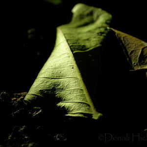
1.

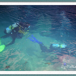
2.

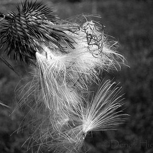
3.

4.

5.

1.
2.
3.
4.
5.
")

![[No title]](/data/xfmg/thumbnail/38/38749-a4ef503184d13a9c7592221cb44ac5e8.jpg?1619738704)