kellylindseyphotography
TPF Noob!
- Joined
- Mar 26, 2008
- Messages
- 1,270
- Reaction score
- 0
- Location
- Haverhill, Ma
- Can others edit my Photos
- Photos NOT OK to edit
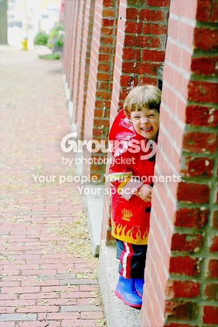
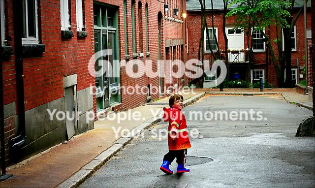
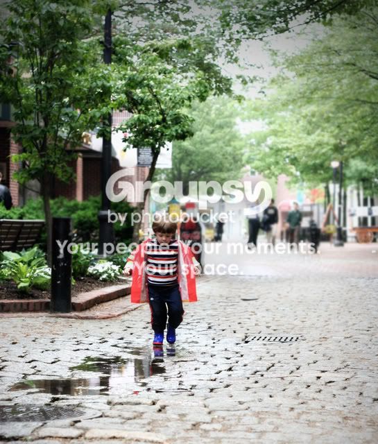
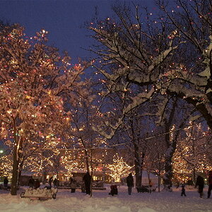
HHCC welcome. This is just my son and I'm still just in the mode of practicing exposure, comp.. basic things. I am also in the process of finding my "niche" in post processing so I'm looking for hard critiquing on that. He's great because he's very hard to shoot (refuses to look at the camera, is very sick of me taking his picture, and runs when he see's me take it out  ) so he's really great practice. I would really appreciate any/all critique
1.
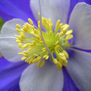
2.
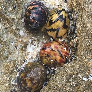
3.

3b (with texture)

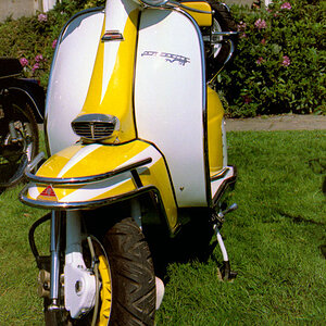
4.
) so he's really great practice. I would really appreciate any/all critique 1.
2.
3.
3b (with texture)
4.


![[No title]](/data/xfmg/thumbnail/34/34079-552f58c1ec0f8485f9c24a5b1db49654.jpg?1619736268)