5 Summer Holiday Shots for C&C

fokker

No longer a newbie, moving up!
Joined
Jun 23, 2009
Messages
2,829
Reaction score
295
Location
New Zealand
Can others edit my Photos
Photos OK to edit
Some shots from my summer holidays so far (in New Zealand, so it's summer time for us southern hemisphere folks). C&C is appreciated.

#1 Leaving Wellington city on the interisland ferry:

4215013292_9b44b86317_b.jpg


#2 Passing the other ferry along the way

4214243933_99827361e2_b.jpg


#3 Governer's bay in the Marlborough sounds:

4214358731_fabe1d9ff6_b.jpg


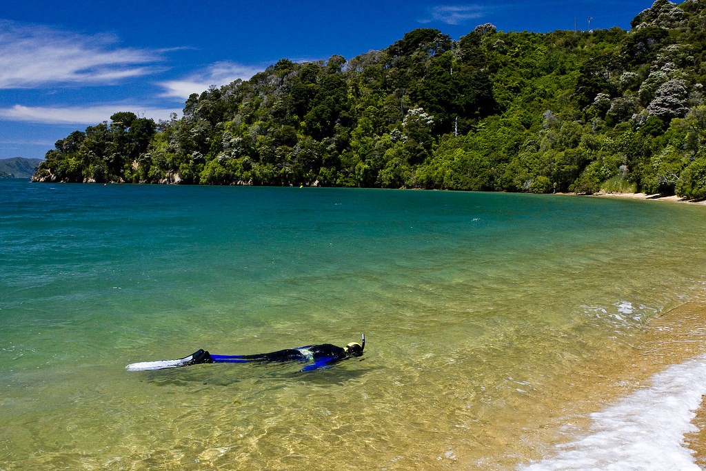
#4 Snorkelling in Governer's Bay. We didn't catch anything but saw a couple of huge stingray's. We thought of Steve Irwin and decided not to spear them :meh:

4214362107_fb98b2cb5a_b.jpg


#5 Tom Cane's Bay, another bay in the Marlbrough sounds where we went snorkelling. Also, aside from the actual shot, does the border look okay?

4215127696_cc375d65e8_b.jpg
 
Last edited:
#1 and #2 are soft and need a bit of sharpening. The water and bottom of the boat are both dark and seem to blend too much. The sky is bright and that is only accentuating the darkness of the water. Maybe bring up the levels in the water and use a gradient filter to darken the sky after that. Just MHO
 
Fokker, being a spearo myself I must apologize for the hostility towards you in that other thread. Great shots, I really love the composition of #3 with the tree in the forground. :hug::
 
love the last two pics the most... just seems like you were able to get everything in ...sand, water, sky and blend it like an oil painting
 
I'm not too sure about the border in the last shot. Because the edges of the beach are cut off, it seems like the border is really squeezing the shot. Also, the gray doesn't fit well with the colors of the picture and it almost takes away from the warmth of the beach and nice brightness of the picture in general.

The rest of the shots look good0. I really like the first one.
 
I like #1 and #3 best, but not a big fan of the border though.
 
Well, I'll also hop on the bandwagon... :D

#3 appeals to me the most...colors, composition, everything. I also like #1, but #3 is by far my favorite.
 
#1 and #2 are soft and need a bit of sharpening. The water and bottom of the boat are both dark and seem to blend too much. The sky is bright and that is only accentuating the darkness of the water. Maybe bring up the levels in the water and use a gradient filter to darken the sky after that. Just MHO


Thanks for the comments. I tend to agree on the softness. I did no sharpening from raw on both images. For #1 this was intentional, #2 I think I just forgot. The more I look at #2 the less I like it, even though it was beautiful to see in person, as there was only a patch of bright yellow sunlight across an ocean of blue and a dark sky. I tried a different edit of a slightly wider photo I took of the scene, which I think looks a lot better:

4220634320_15e097c84a_b.jpg


Fokker, being a spearo myself I must apologize for the hostility towards you in that other thread. Great shots, I really love the composition of #3 with the tree in the forground. :hug::

Apology accepted. Nobody really likes arguing on forums anyway do they?
:blushing:


I'm not too sure about the border in the last shot. Because the edges of the beach are cut off, it seems like the border is really squeezing the shot. Also, the gray doesn't fit well with the colors of the picture and it almost takes away from the warmth of the beach and nice brightness of the picture in general.

The rest of the shots look good0. I really like the first one.

Yeah, I'm a bit undecided, just thought I would start experimenting with some different border designs and colours as I never have before. It is a pity I wasn't able to get all the water in that shot, but even at 10mm it wasn't quite wide enough :confused:

To everyone else, thanks for the comments!
 

Most reactions

New Topics

Back
Top