A Born Leader.

gizmo2071

TPF Noob!
Joined
Oct 19, 2006
Messages
861
Reaction score
0
Location
Toronto, ONT
Website
www.ummonshadow.com
Can others edit my Photos
Photos NOT OK to edit
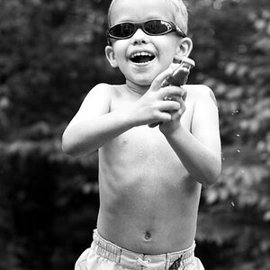
Yet more playing with my new lights.
Black material used for the back drop.
One flash unit set to my left and slightly behind aiming at my back with reflector umbrella.
One flash to the left of the camera, quite high aiming down with softbox.
50mm prime.
125/f11.

Not great, but I'm only just learning the nature of studio lighting :D

Your thoughst are most welcome.

roar.jpg


and a B&W conversion
roarbw.jpg


and just a different style.
oooooo.jpg


Thanks for checking them out :D
 
the first one is great
im not feeling the B&W conversion though

in the last one the nose ring is kinda distracting but its still another good one
 
I like 'm all. But I don't see 'Born Leader' in the first two. I see 'protester'. (that is not really important, just sharing my POV)


pascal
 
Thanks guys.
I don't know why I called the thread born leader.
I just couldn't think of a title, has no relevence to the images heh :D

Why does everyone find my nose piercing distracting in photos haha :lmao:
Maybe I should start taking it out when I take photos of myself.

I wasn't sure about the B&W. I think it would have worked better if there was a background for extra contrast, but I thouhgt I'd share it anyway to see what people thought.

Thanks again guys :}
 
its not distracting in the first two (for me atleast) its jus that in the third one it looks like you have a silver bogger lol.. i dont know but it was the first thing that caught my eye in the last one :)
 
I like the last one best! For the first two I think the light isn't bright enough, his coat almost gets lost, but it may be my laptop screen!
 
I'm with the others...color on the first shot. The color shot gives it a different mood against the dark bg. Makes it feel more like it was done...outdoors maybe?

And like EB, my fav is the last one. I do find the nose jewlery in that one distracting, but it's a simple fix in PS.

In case you haven't noticed, I think it's good to break the 'rules'. I think that always following the rules is boring. Like in the first, your glove is completely blown out around the sleeve...and I don't care :biggrin: I think it adds to the edgy feel of the shot.
 
I like 1 and 3 the most. Especially 3 after looking at it more. The background blurring and around his outline. It has a really nice hard to explain almost scary? feeling to it
 
My first thought when the picture came up was, "Didn't that guy know he had boogers hanging out his nose?!". But then I realized it was a nose ring and still couldn't take my eyes off the nostrils.

Lol thanks.
I get the message.
Any lower angled closer shots I need to remove my piercing. :greenpbl:

I like the last one best! For the first two I think the light isn't bright enough, his coat almost gets lost, but it may be my laptop screen!

I'm pressuming it's your laptop screen.
I think you can clearly see the whole outline set apart from the background.... I think.
And Thank you :)

I usually go for portraits in black and white, but I think the color version is much stronger here. Nice job :)

Thank you :)
I prefered the colour version aswell. :D

I'm with the others...color on the first shot. The color shot gives it a different mood against the dark bg. Makes it feel more like it was done...outdoors maybe?

And like EB, my fav is the last one. I do find the nose jewlery in that one distracting, but it's a simple fix in PS.

In case you haven't noticed, I think it's good to break the 'rules'. I think that always following the rules is boring. Like in the first, your glove is completely blown out around the sleeve...and I don't care :biggrin: I think it adds to the edgy feel of the shot.

Thank you :D
That's what I thought about the colour version. I think if there was a background of some form, the B&W version may have worked better... maybe.
I'm seriously going to have to learn to remove my nose piercings.
In most of my shots at least a couple of people mention it haha :lol:
I don't know the ruls to break them yet... heh, so I'll set my own rules. Free-for-all

I like 1 and 3 the most. Especially 3 after looking at it more. The background blurring and around his outline. It has a really nice hard to explain almost scary? feeling to it

Thank you :mrgreen:
It's cool that you can't explain it, I can deal with that. :greenpbl:
 

Most reactions

New Topics

Back
Top