Desi
No longer a newbie, moving up!
- Joined
- Sep 28, 2011
- Messages
- 832
- Reaction score
- 378
- Location
- Los Angeles
- Can others edit my Photos
- Photos OK to edit
I took these of my friends a few weeks ago. I was hoping you could take a look and give me your thoughts on them.
These were taken on a cloudy day near sunset. My major challenge was balancing the low ambient light and lighting the subjects with flash. Most of these are shot on manual exposure mode with meter reading taken off the sky. The flash was on-camera for fill flash. My trusty assistant abandoned me because it was cold, so I had nobody to hold the flash for off camera flash (I left the stand in the car). I am fairly new to flash photography, so would appreciate your comments on the lighting.
Clothing choices: she wore bright, reflective running shoes, so I asked her to go barefoot. I couldn't decide what was worse, the black jacket, or the shirt which was the same color as the sand and surrounding rocks. It was kinda cold (in a Southern California sort of way), so we kept the jacket.
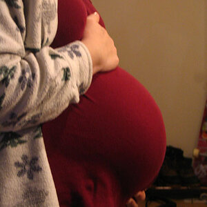
I previously posted some shots of this couple earlier,http://www.thephotoforum.com/forum/...oto-gallery/266805-preggo-pics-cc-please.html, but had not yet done so at the time these shots were taken. So the same criticism applies to these. I didn't really catch the connection between mother and child.
Other issues: I definitely tend to under-expose my photos. I don't have an eye for white balance (though it is improving with practice).
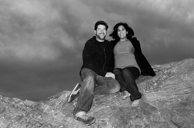
1. Timmy and Lupe at Leo Carrillo Beach. I know....horizon is at midline. I was trying to put them into thirds. I cropped too close to the foot.

DSC_1269.jpg by Javier Descalzi, on Flickr
2. Trying to keep a more dramatic sky.

DSC_1306.jpg by Javier Descalzi, on Flickr
3.
DSC_0013.jpg by Javier Descalzi, on Flickr
4.

DSC_0032.jpg by Javier Descalzi, on Flickr
5.

DSC_0057.jpg by Javier Descalzi, on Flickr
Thanks for looking.
Desi
These were taken on a cloudy day near sunset. My major challenge was balancing the low ambient light and lighting the subjects with flash. Most of these are shot on manual exposure mode with meter reading taken off the sky. The flash was on-camera for fill flash. My trusty assistant abandoned me because it was cold, so I had nobody to hold the flash for off camera flash (I left the stand in the car). I am fairly new to flash photography, so would appreciate your comments on the lighting.
Clothing choices: she wore bright, reflective running shoes, so I asked her to go barefoot. I couldn't decide what was worse, the black jacket, or the shirt which was the same color as the sand and surrounding rocks. It was kinda cold (in a Southern California sort of way), so we kept the jacket.
I previously posted some shots of this couple earlier,http://www.thephotoforum.com/forum/...oto-gallery/266805-preggo-pics-cc-please.html, but had not yet done so at the time these shots were taken. So the same criticism applies to these. I didn't really catch the connection between mother and child.
Other issues: I definitely tend to under-expose my photos. I don't have an eye for white balance (though it is improving with practice).
1. Timmy and Lupe at Leo Carrillo Beach. I know....horizon is at midline. I was trying to put them into thirds. I cropped too close to the foot.
DSC_1269.jpg by Javier Descalzi, on Flickr
2. Trying to keep a more dramatic sky.
DSC_1306.jpg by Javier Descalzi, on Flickr
3.
DSC_0013.jpg by Javier Descalzi, on Flickr
4.
DSC_0032.jpg by Javier Descalzi, on Flickr
5.
DSC_0057.jpg by Javier Descalzi, on Flickr
Thanks for looking.
Desi
Last edited:
")