- Joined
- Sep 2, 2003
- Messages
- 34,517
- Reaction score
- 7,544
- Location
- In the mental ward of this forum
- Can others edit my Photos
- Photos NOT OK to edit
Here is what I have been working on the last couple of weekends.
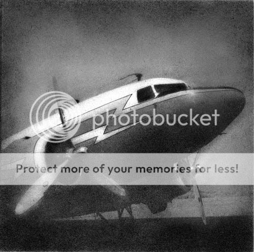
This image was taken by my husband with the Rollei. Its a DC-3, shot with Konica infrared. The minute I saw this negative I wanted to turn it into a bromoil print - with his permission, of course.
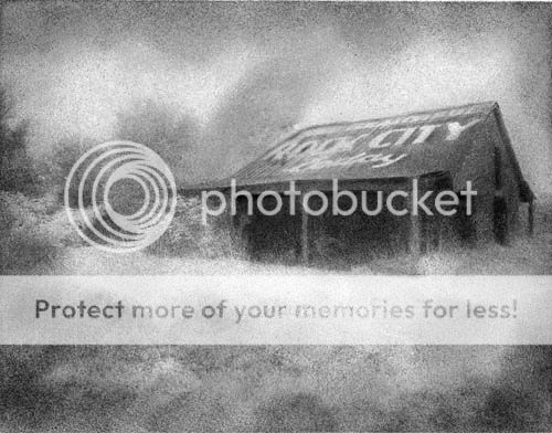
Here is one that I experimented further with. This was from a very dense HIE negative, since I took this shot on an overcast, drizzling day, terrible for HIE but I loved this barn and was in another state, so took my chances.
See Beautiful Rock City - today!
I made two bromoils from this negative, and decided to tone one with coffee. I had read about this technique and thought Id give it a try. I wanted to keep the letters white, so painted some masking fluid over them before toning. I dumped about 4 cups of coffee into a tray of water and pulled the print every 5 minutes or so till I liked it. As it turned out, removing the frisket also removed all prior ink Id laid down, and the letters went stark white. I let it dry overnight and used some chalks to add additional color.
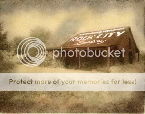
Of course, Ive no idea what long term effect using an organic substance like coffee will have, so it will be interesting to observe it over the years. I may switch to using watercolors!
Any thoughts, opinions on these? Im curious if you guys like the colorized bromoil, or prefer the classic B&W look. Would love some input. Thanks!
This image was taken by my husband with the Rollei. Its a DC-3, shot with Konica infrared. The minute I saw this negative I wanted to turn it into a bromoil print - with his permission, of course.

Here is one that I experimented further with. This was from a very dense HIE negative, since I took this shot on an overcast, drizzling day, terrible for HIE but I loved this barn and was in another state, so took my chances.
See Beautiful Rock City - today!


I made two bromoils from this negative, and decided to tone one with coffee. I had read about this technique and thought Id give it a try. I wanted to keep the letters white, so painted some masking fluid over them before toning. I dumped about 4 cups of coffee into a tray of water and pulled the print every 5 minutes or so till I liked it. As it turned out, removing the frisket also removed all prior ink Id laid down, and the letters went stark white. I let it dry overnight and used some chalks to add additional color.

Of course, Ive no idea what long term effect using an organic substance like coffee will have, so it will be interesting to observe it over the years. I may switch to using watercolors!
Any thoughts, opinions on these? Im curious if you guys like the colorized bromoil, or prefer the classic B&W look. Would love some input. Thanks!


 You make me wish we had room to set up our darkroom here. **Wonders what it would take to get one of these prints out of Auntie Terri for our house? hmmmmmmm**

![[No title]](/data/xfmg/thumbnail/37/37629-fa70c9f81cc7da4d6a9b512502f9bf84.jpg?1619738155)
![[No title]](/data/xfmg/thumbnail/37/37630-10bda987ab220dc60e7c1cb65502f83c.jpg?1619738155)

![[No title]](/data/xfmg/thumbnail/33/33846-dc3d508d5436a047770e1d5c2cbdd593.jpg?1619736165)
