A couple of orchids at work.

robertwsimpson

No longer a newbie, moving up!
Joined
Aug 3, 2009
Messages
2,471
Reaction score
30
Location
West Palm Beach, Fl
Website
www.flickr.com
Can others edit my Photos
Photos NOT OK to edit
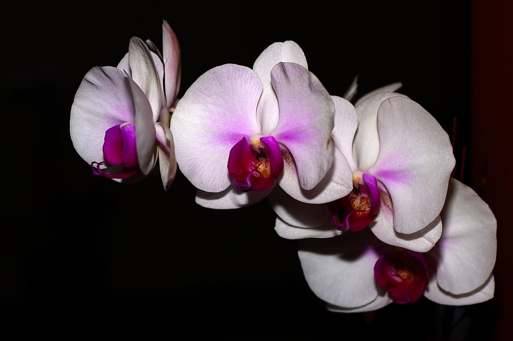
I was experimenting with a little bit of flash... let me know what you think.

exhibit A
4166423250_967f0e6a59_b.jpg


exhibit B
4166423490_01dae28a88_b.jpg


thanks for stopping by!
 
I much prefer exhibit A. The drama of the dark background, the brilliance of the flower's color, and the composition, all add to the beauty of the image.
 
thanks, I like b better too. I shot the flash straight on the flower in a so that I could blast the blooms with light and achieve a black background. unfortunately this lead to shadows:( oh well, I think B with an actual black background is the way to go.
 
The first one is to much flash complete with distracting shadows and no background.
The second one is better but is a bit underexposed and the stems in the background are a distractioin.
The second shot if a reflector had been used underneath to get some light into the bottom of the flowers and a different angle (or closer) so the stems weren't in it, would be pretty good.

I didn't want a background in the first one. That's why I used that much flash. I think that the less background there is, the more of your attention is focused on the flowers themselves.

I don't think the second one is under-exposed. In fact, there are a lot of areas that are blown out from over-exposure. I'm not sure what you're getting at. Also the background being a distraction, why would you say that when your criticism of the first is that it doesn't have a background?

I will keep in mind the "lighting from the bottom" comment. That one I do understand. The rest needs clarification.
 
Hi Robert,
I am at work now so I can't see the pics so working from memory.
A closer crop would have worked better, if you don't want a background don't leave it there. Just black space for a background does not add to the photo.
The stronger flash creates to many shadows.

The second picture is underexposed, you may have some hot spots but overall it is underexposed. A clean background with nice bokeh adds to a photo does not detract. A background with a couple of stems in it does not add it distracts.

Try to find someone on the internet who does really professional quality flower pictures and go to school on those. You will see the lighting is nice and even and the flowers are isolated to attact your attention and the shots do not have distracting backgrounds.

Just trying to help out...
 
Flickr: Flowers on Black

Just black for a background is a pretty standard method of isolating a subject in a photo. And it's particularly popular in flower shots. Just sayin'.

The first shot doesn't work for me for all reasons mentioned above. I'm also not sure about the bit of orange on the right. I don't know what it is, and it pulls my eye. I get what you were going for, though! Keep practicing! I love these kinds of shots and they can be very fun to take once you get the hang of it. :)

The second shot, on my screen, is not underexposed at all. As Robert pointed out, it has hot-spots. The parts of the photo that are not hot show as well exposed for me. The stems are framed well and add context and leading lines to the main subject. The one adjustment I would make would be to crop a little tighter on the left side. As is, it's a tiny bit unbalanced for me somehow and I think that extra bit of space is the culprit. I quite like this photo, even with the hot spots mentioned above. It's colourful and feels vibrant.
 
Last edited:
interesting. I purposefully left the "bit of orange" and the extra space on the left. I quite like negative space, but I think I have a tendency to take it overboard, as I get critiqued for it on most of my photos lol. I'll have to start being a little more mindful of it.
 

Most reactions

New Topics

Back
Top