A few head shots from today

OLaA

No longer a newbie, moving up!
Joined
Aug 5, 2012
Messages
259
Reaction score
48
Location
Sacramento, CA
Can others edit my Photos
Photos NOT OK to edit
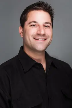
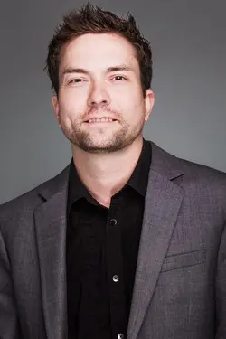
We have a few new interns here at the office. Decided to do a few quick head shots of them and a couple guys from the sales team. I usually go straight to either butterfly or loop lighting. Easy to setup and take down. Decided to do clamshell style lighting with a few added reflectors and like to hear your thoughts if it was successful or not.

Disclaimer: these edits are about 95% complete. Still need to be taken into PS to clean up a few details and some spot removal.
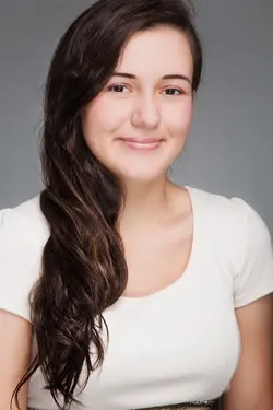

$IMG_3388.jpg

$IMG_3394-Edit.jpg

$IMG_3402-Edit.jpg

$IMG_3404.jpg
 
Actually didn't do much softening at all. Just global clarity. Her skin is unbelievably smooth in real life.
 
The lighting pattern seems fine, but the lighting intensity seems just a little high; the specular highlights seem just a little (~1/3 stop?) bright to me. What really bothers me about these however is your shooting position. Generally speaking, headshots (esp. 'who's who board type shots which these appear to be) should be taken at eye-leve; yours are all below eye level from slightly (#1) to severly (#4).

There are appropriate times to shoot from below eye level; generally it's a 'power-projection' composition, such as this one. Note that the expression is consistant with a "Boss"; superior, disdainful, etc. This one is shot right at eye level, and combined with a pleasant, cheerful expression shows a whole different 'person'.

If you are going to shoot low, the expression should be appropriate. Also, watch your expressions, #2 is just a little too 'toothy' IMO.

Just my $00.02 worth - your mileage may vary.

~John
 
Great observation. Thank you.
 
I'm not a fan of the lighting pattern for the two men. Both men have shadows on their necks, from where the light kicks upwardly, casting an "up-shadow" from their shirt collars. To me, that looks very bad. Both men have dark shirts or jackets, but their faces are really bright, and the light looks, well, it doesn't look good.

For the two women, this bright, almost shadowless, shapeless lighting looks a bit better (more traditionally female, with low-texture lighting that hides wrinkles and maximizes skin smoothness), and since both of them have some makeup on, their skin highlights are not so hot as they are on the men.

I'm not quite following the logic underlying the framing. The tops of both womens' heads are cropped off awkwardly, and both guys crowd the top of the frame uncomfortably, and in all four shots a very large amount of the frame is devoted to the chest area and the clothing of the subjects. The fellow on the bottom...the image goes a full four buttons down on a 7-button dress shirt, and the bottom-most button is highlighted and right on the edge of the frame--very distracting. I just do not 'get' the framing here.

I don't want to seem to be busting your chops, since you seem like a great guy and a really nice fellow, but I do not like the way any of these four frames were done.
 
No worries i appreciate the feedback. It's helpful and worth considering. I found the frames pleasing but I'm reconsidering. Each shot is cropped so I can go back and play with them. Good info guys to take in before i finish editing.
 

Most reactions

New Topics

Back
Top