A Few New Images of Alyx C&C Welcome!

JMLPictures

TPF Noob!
Joined
Nov 26, 2009
Messages
133
Reaction score
0
Location
Phoenix Arizona
Website
www.jmlpictures.com
Can others edit my Photos
Photos NOT OK to edit
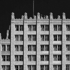
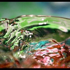
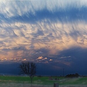
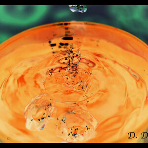
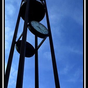
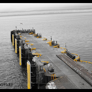
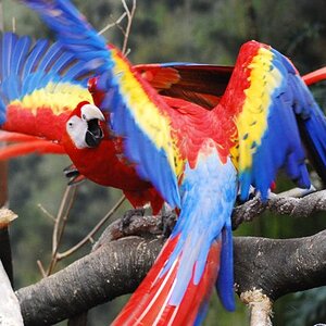
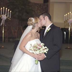
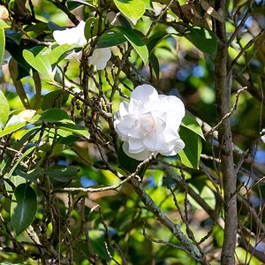
Let me know what you think! Which is your fav? Which is your least fav? And why? Thanks Guys

1.
new-1.jpg


2
new-2.jpg


3
new-3.jpg


4
new-4.jpg


5
new-5.jpg


6
new-6.jpg


7
new-7.jpg


8
new-8.jpg


9
new-9.jpg


10
new-10.jpg


11
new-11.jpg


Josh
 
It's tough to comment on a series of images like this without knowing the context. Were you hired to shoot these, and if so, what were you hired to achieve? Or were you just shooting them for your personal portfolio, and again, what was your goal? Are you going to use the images to market yourself to get this sort of edgy portraiture? Because depending on what the purpose of the shoot was, I might think they are great, or they are not.
 
I was going for a series of higher/more fashionable portraits. Something more than the normal run-of-the-mill ones. I was also playing with new lighting techniques. This was not a paid gig. It was for my portfolio. I am in the process of getting another website going.

Josh
 
Seems like a lot of blown highs unless thats what you were going for. Looks like the first one is the only one without a giant contrast split. Model is also very unexpressive.

I do like the setup of # 3 the best. Just wish her skin wasnt blinding.
 
On my computer all her skin towns are still visible. You can still see the texture in her skin. They don't look blown out at all... Not sure why they look like that on here. Yes a few are supposed to look a little more bright such as 10.

Maybe ill post links to some high-res ones and you can see if it still looks blown out to you.

Thank you for the feedback though.

Josh
 
I was going for a series of higher/more fashionable portraits. Something more than the normal run-of-the-mill ones.
Josh

I'd be very cautious with trying to market high-fashion style portraiture. A lot of photographers these days are trying to emulate what they see in fashion magazines. But remember that those fashion images have a completely different purpose than portraiture. They are trying to sell the fashion or product, whatever it may be - clothes, perfume, jewelry. The model is only there to support the products and convey whatever theme the art director was going for. The model's "portrait" is of no value to the fashion photographer. He/she is simply a prop in the shoot. Often the reason fashion models look so expressionless is because the idea is to not call attention the model, but instead to keep attention on the product. The main exception is make-up ads where the model must have expression because the make-up is on her face.

So it's dangerous for a portrait photographer to copy the fashion photographer approach because we're doing just the opposite. We want to sell the "portrait". The clothes, jewelry, etc. are of lesser importance to us. So we want expression in our clients. It's the expression and emotion that will sell a portrait. So unless you're trying to break into fashion photography, I'd be careful with the look you promote. Just my opinion.
 
I like them. #10 is my least favorite.
#2 I dont like the way her chest look. It looks very flat (not dissing her bra size). I feel that I should see a little contour in the middle of the chest. Looks very weird I think. I think the brightness took all that away.
 
Most favorite-6, her shooting with the Pentax. It has a sort of campy, fun feeling to it.
Least favorite-that's a tie. First off, I dislike 10, due to the large areas of blown-out whites and the unflattering, sprawled out, falling-out-of-the-chair posing. In second place for my least favorite is #7, simply because of the off-center composition. Her hair is pretty and everything, but that big black square in the background is stealing from her in the foreground.
 
On my computer all her skin towns are still visible. You can still see the texture in her skin. They don't look blown out at all... Not sure why they look like that on here. Yes a few are supposed to look a little more bright such as 10.

Maybe ill post links to some high-res ones and you can see if it still looks blown out to you.

Thank you for the feedback though.

Josh


Is your monitor calibrated?

Edit: hmmm, histo doesnt show any blown channels. But there is a distinct lack of detail in all your highlights?
 
Im pretty sure it's just the small versions. I know they are close to blown but in the high-res i can def see skin texture.

Thanks for the comments guys! I appreciate them all.

josh
 

Most reactions

Back
Top