A few pics C&C Please!

NorCalBa11er

TPF Noob!
Joined
Aug 28, 2009
Messages
13
Reaction score
0
Location
Orange County, CA
Can others edit my Photos
Photos OK to edit
Been on this site for a few months now, but haven't been brave enough to post anything photos for C&C. But it's a pretty slow Friday in the office and I'm bored, so here goes. Comments will be much appreciated.

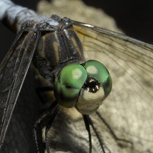
1. One of the first taken with dslr, my sister just got engaged and wanted me to get some shots of her bling (about a month after I got my camera), didn't have any flash or anything!
3557734290_6b3bf8c58d_b.jpg


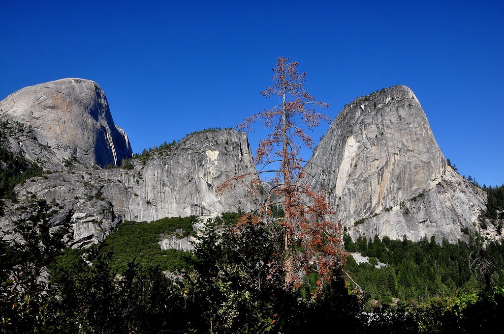
2. This was taken from my Half Dome hike a couple months ago, it was shot mid-day, so I had to tweak the colors a little bit.
4081019208_54d78da78c_b.jpg


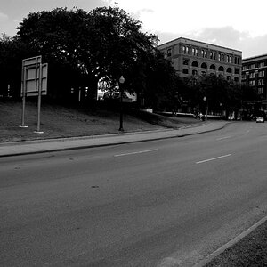
3. During a recent business trip to China, I went to an import/export fair in Guangzhou. They had a temperature gun pointed at EVERY person entering the fair (which had probably 50,000 entering daily).
4080270619_5cf014db78_b.jpg


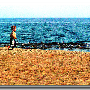
4. A quick snapshot in the streets of Guangzhou, one of my favorite shots because it gives a glimpse of the real China.
4080272317_9c5231f30e_b.jpg
 
Idk, none of these shots really stand out to me, im normally much more critical at night, but ill try to give some fair judgments on all the pictures.

@ pic 1
I like the idea of the picture, but dont quite understand the reasoning for her holding the tickets or whatever she is holding, the main focus of the picture should be set on her finger, not on what shes holding. To be honest i think she is very distracting, her smile is cheesy and the green couch is not helping to bring in any decent non-distracting background in.

@ pic 2
The picture itself isn't bad, but the tree in the middle is very frustrating as it takes away from the most important part of the picture, kind of wondering wether you intended to put it there, which i dont feel would have been a great idea if this was your idea. The colors are a tad over-saturated, but only by a hair, so nbd, id also say that i would have been more intrigued if the angle had changed, i feel like this was taken more as a snapshot than anything else.

@ Pic 3
This is probably my favorite picture, more of a photojournalism type pic then artistic or anything, but i also feel like the room or horizon is a bit slanted, which can be fixed in a good crop. What pp software do you have btw? Also i would say that a lower f stop would help bring the attention only to the security guard and the girl hes pointing the gun at, the back is FULL of life thats really not needed in this picture.

@ Pic 4
I dont really understand this picture, you dont have a clear subject, and theres kind of crap all over the place that detracts from the overall picture, not much to say on this. I guess im liking his pose and facial expression, but overall dettered due to the picure itself.
 
Pic 1.
I don't like this picture. The puke color background with the pink shirt are just to far off for me. When taking pictures of people always keep the eyes in focus or make the subject (in this case the tickets) take up most of the picture with parts of a person behind. With so much body showing the eyes need to be the focal point.
Pic 2.
I don't know where to start with this picture... Ill just say I think the bottom dark section should have been cropped off while taking the picture and that the picture was a little over exposed. Poor composition.
Pic 3.
Great capture of the moment. Exposure is great but the depth of field could be a little shorter. I think his expersion is the best because its the most natural. Good picture but nothing really "sell-able."
Pic 4.
This picture is almost perfect. If the composition was horizontal and that so the other person working was'nt in the picture it would have been very good. This guy could'nt yell as loud as this picture shouts out how hard his life must be. I would have stepped to the right a few feet (getting the other guy out) and held the camera horizontally. The focal distance works.

The bottom 2 are much stronger than the top two. Keep it up and have fun!
 
Thanks for the comments guys, really appreciated! Yeah like I said #1 was one of the first pictures taken on an dslr and it clearly shows. As for the second, the tree in the middle was intentional, I thought it added a little something to the whole scene (maybe it's just me). The last two were quick snapshots, just the spur of the moment.

Will try to do better next time.
 
Your sister is just too pretty to be out of focus. And, the picture doesn't really tell the story. And, as said, the tickets add to the confusion.
Rest are just sorta OK snapshots.
 

Most reactions

Back
Top