A Few Portraits for C+C

caseyrbrown

TPF Noob!
Joined
Aug 11, 2013
Messages
33
Reaction score
6
Location
Pennsylvania
Can others edit my Photos
Photos OK to edit
Hi TPF,

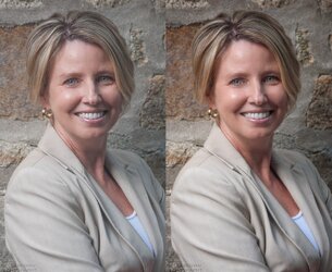
I took a few more portraits with my new 85 f/1.8D. These were for a family friend who was interested in having updated corporate portraits. Classy and reserved was what I was going for

All are taken with a Yongnuo 560 ii through or off of an umbrella.

Let me know what you think and what I can improve on

1. DSC_0030.jpg by CaseyrBrown, on Flickr

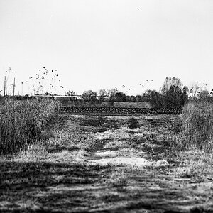
2. DSC_0063.jpg by CaseyrBrown, on Flickr

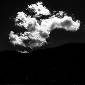
3. DSC_0036.jpg by CaseyrBrown, on Flickr

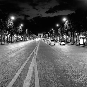
4. DSC_0006.jpg by CaseyrBrown, on Flickr

Again, I'm open for C+C
 
yep - MIA.
 
I generally avoid shooting people, so take this with a grain of salt.

I like the background in the the first and last shots, but her leaning back looks funky. I like the second one the best but it is cropped too close for me. Three is nice - maybe a bit too square to the camera?
 
The last one is my favorite. I agree with snowbear, the 2nd is cropped too close...
 
I like the third the best. It's sharp and clean.
the first, her blazer is too busy... the second has drab colors; she matches the background... the last one doesnt have a flattering pose.
 
I don't have a problem with the close crop, only because sometimes those corporate profiles are shown small and you want to minimize the background so you can actually see the person's face. But for those closely cropped ones, the background maybe should contrast more with the subject. Her hair, skin tone, clothing and jewelry pretty much match the background almost exactly. Put her in a dark jacket for that one maybe. Otherwise, they look pretty great to me.
 
Thanks for all the input everyone. I'm always trying to up my portrait game and all of you are a big help!
 
The main thing bothering me about most of these is white balance. The first two look significantly too cool to me. Too blue/cyan. Third one looks okay. Fourth one too green maybe?

Other details:
1) Why is she so tilted? I am sort of distracted by this. If she were straight and less blue, though, I have no complaints Good angle, lighting is okay, achieves desired mood.
2 & 4) Both very gray / low contrast. Easy to change in post processing, just like white balance, though. I'd use curves to bump the contrast up on both by a significant amount.
3) Good all around. The close crop on the left is a LITTLE distracting, not because it's a close crop, but because the jacket and background and then the white of an internet page forms a rapid one-two-three contrast change that draws my eye. If this were displayed on a black background, it wouldn't be an issue at all. Even as it is here though, minor point. Good contrast, color, pose, everything on this one. Most successful, I think.


Example edit I did of #2:

$portrait.jpg

Things I did:
1) about 6 points more yellow and 6 points more red
2) Contrast simply with levels alone (pulling the shadows in to where the data was and the highlights to where the data was. No curves).
3) Lowered the contrast a bit on the face alone (curves)
4) Did a little light skin work (50% transparency clone brush, single passes over largest wrinkles and such. So that you still see wrinkles and she won't be insulted or not look like herself, but they're de-emphasized and subtly flattering).
5) Duplicated the layer, Gaussian blurred it a bit, put that at 15% transparency to slightly soft focus it, and then erased the eyes in that layer to keep them maximally sharp
6) Slight vignette added.
 

Most reactions

New Topics

Back
Top