J_T
TPF Noob!
- Joined
- Mar 15, 2012
- Messages
- 174
- Reaction score
- 12
- Location
- Behind you.
- Can others edit my Photos
- Photos OK to edit
Hey guys! I just went to Italy over the summer and had a great time taking pictures and I think this is some of my best work...
But I still want to hear all the critique you can give! I've posted a few photos over the past few months and haven't been geting many replies so please comment on this one. I want everyone's opinion")
#1
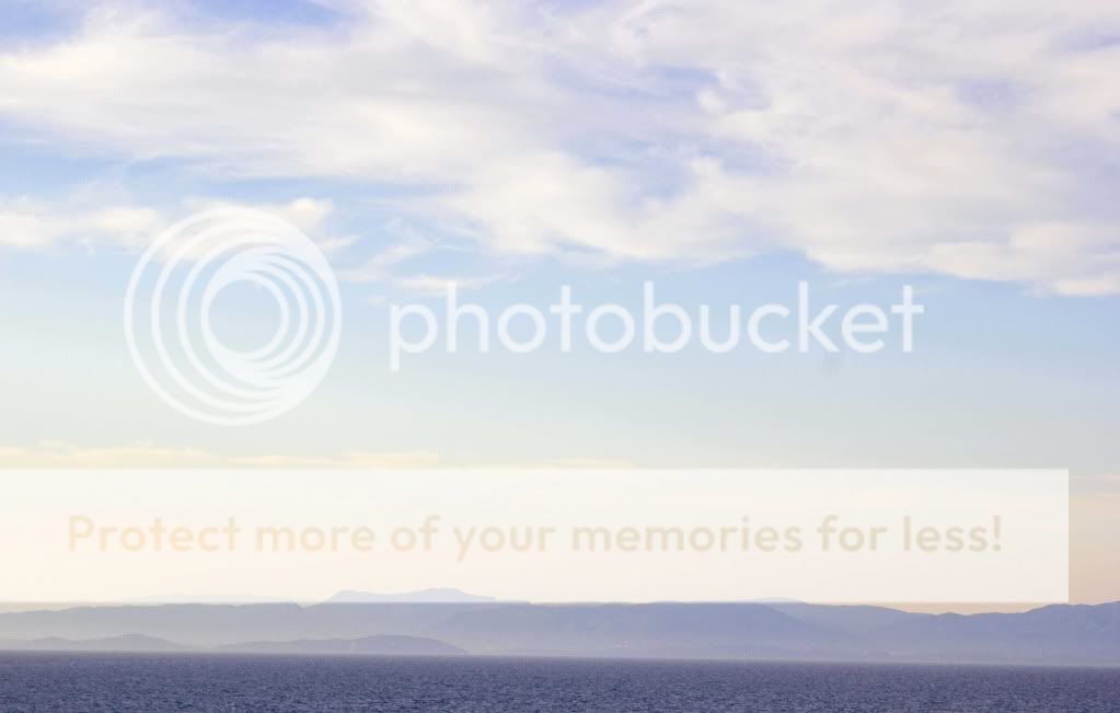
Traveling to Italy on the ship
#2
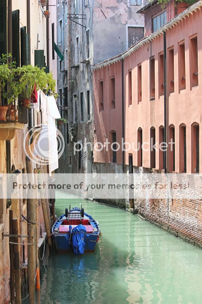
Venice's (Italy) famous canals...
#3
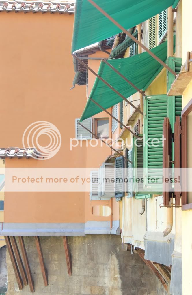
Colourful!
JT
But I still want to hear all the critique you can give! I've posted a few photos over the past few months and haven't been geting many replies so please comment on this one. I want everyone's opinion
#1
Traveling to Italy on the ship
#2
Venice's (Italy) famous canals...
#3
Colourful!
JT
![[No title]](/data/xfmg/thumbnail/42/42281-7e2c2677bdc791ca1918fb67b6b760c5.jpg?1619740089)