A mosaic called " Ladakh" ( C &C solicited please)

Jasii

No longer a newbie, moving up!
Joined
Jun 17, 2015
Messages
470
Reaction score
171
Location
Dharamsala, Himachal Pradesh, India.
Can others edit my Photos
Photos OK to edit
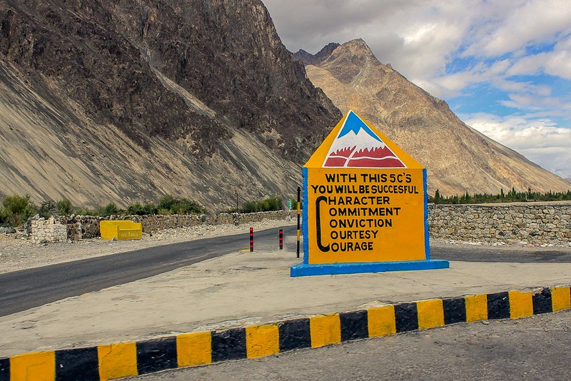
Dug this one made in Ladakh, out from the archives, I'd call it "Mosaic called Life". Had me pleasantly surprised as to, it's relevance in everyday life.The 5 C's share God's love with humans, the way he envisaged human race would progress, many unfortunately got binned in our quest to face the vagaries of Life. Simple but essential virtues that would make us Credible, Charismatic, Capable and above all: " Complete." ( Now that makes it 9 C's now:) ) Do tell me your views about the shot and whether you think the FG & the BG compete for attention?
Rgds,
Jasii

A mosaic called ladakh by jasiiboss, on Flickr
 
Last edited:
My way of looking at the pic was to keep everything tack sharp and let the eye start from the bottom and work it's way up. I just did a quick dirty fix to calm down the FG a wee bit, just applied a reverse grad to the FG. Would love to have you opine. In case you think there was another way where the objective can be met in post processing, I am all ears .
Having said that I still like my original pic better. :)
A mosaic called ladakh -1 by jasiiboss, on Flickr
 
Here's my C&C:

As I look at this image, I'm distracted by the orange and black curb and I find myself holding my hand over that part of the image to image a crop in which the curb is eliminated. The left side also doesn't add much and can safely be eliminated. This draws the subject in. (I would suggest a crop to remove the bottom and left parts of the image).

The horizon line appears to be a little un-level and needs to be straightened (a very slight clockwise rotation -- easy adjustment.)

I find the colors of the sign to be quite a distraction against the beauty of the landscape beyond, but I'm thinking you wanted to juxtapose the sign with a mountain against the actual mountains. You might consider a black & white conversion on this.

Lastly, in addition to not wanting to see the left side, I'm wondering what is off to the right side because the mountain beyond doesn't quite make it down to ground. What would have happened if you had adjusted your camera to point just slightly more to the right (putting the sign to the left 1/3rd of the frame)?
 
My thoughts. The image is tipped a bit to the left. The curb in front doesn't really bother me, but I do think the image would be stronger with the left side gone. A crop just at the right edge of that yellow thing by the road [kind of looks like an old chair?] Since the sign is obviously something to do with climbing that mountain in back or the mountain road, it doesn't bother me that its bold and making a statement. Just my opinion. :)
 
Here is where you made your mistake:

"My way of looking at the pic was to keep everything tack sharp and let the eye start from the bottom and work it's way up."


This is very much the way you perceive the image, but not how others see it. The human eye does not see detail with distance, contrast and detail diminish with distance. This is the natural order of things and one of the ways artists produce the perception of depth in images. What you did by making everything the same sharpness is just to equalise the image and make nothing stand out. In other words you flattened the image and stopped the eye wandering.

The picture image is just a 2D page, if you want depth then you can only create an illusion of depth by mimicking the same visual clues that we use to perceive depth in the real 3D world. If you want the viewer's eye to wander through the image then you must create this illusion. If you don't you just present a 2D page that will be read the same as a 2D page.

mod-1.jpg
 
Last edited:
Sort of responding to Tim Tucker's suggestion above, perhaps this roadside monument might have been better revealed had it been photographed with a telephoto lens setting, from perhaps another 20 meters' worth of distance, at say an aperture of f/5.6, so the sign and its message would have been rendered pin-sharp, but the background would have faded to a softer degree of focus. As-shwon and as-shot, there is deep depth of field...the stonework in the wall to the right and on the left draws the eye quite a bit. The monument is fairly small, really QUITE small, compared against the size of the rocky peaks behind it. I can really,really envision this as a 250mm shot at f/5.6.
 
My thoughts. The image is tipped a bit to the left. The curb in front doesn't really bother me, but I do think the image would be stronger with the left side gone. A crop just at the right edge of that yellow thing by the road [kind of looks like an old chair?] Since the sign is obviously something to do with climbing that mountain in back or the mountain road, it doesn't bother me that its bold and making a statement. Just my opinion. :)
Firstly: I wish to Thank you Carol for dropping by.
Yes I do see the tilt that you and other's have mentioned.
That yellow thingy on the left is a concrete bench :) The signboards have been put up by the 'Border roads organisation' to liven things up and to liven it up for the weary travelers, came across another one which read " Go easy on my curves " ;)
Gracias once again.
Jasii
 
Here is where you made your mistake:

"My way of looking at the pic was to keep everything tack sharp and let the eye start from the bottom and work it's way up."


This is very much the way you perceive the image, but not how others see it. The human eye does not see detail with distance, contrast and detail diminish with distance. This is the natural order of things and one of the ways artists produce the perception of depth in images. What you did by making everything the same sharpness is just to equalise the image and make nothing stand out. In other words you flattened the image and stopped the eye wandering.

The picture image is just a 2D page, if you want depth then you can only create an illusion of depth by mimicking the same visual clues that we use to perceive depth in the real 3D world. If you want the viewer's eye to wander through the image then you must create this illusion. If you don't you just present a 2D page that will be read the same as a 2D page.
Meaningful advice Tim! Thank you!!
You just made me go for some reads to brush up the basics all over again :)
Ps. The next one will make me try harder for sure........:02.47-tranquillity:
Cheers!
Jasii
 
Sort of responding to Tim Tucker's suggestion above, perhaps this roadside monument might have been better revealed had it been photographed with a telephoto lens setting, from perhaps another 20 meters' worth of distance, at say an aperture of f/5.6, so the sign and its message would have been rendered pin-sharp, but the background would have faded to a softer degree of focus. As-shwon and as-shot, there is deep depth of field...the stonework in the wall to the right and on the left draws the eye quite a bit. The monument is fairly small, really QUITE small, compared against the size of the rocky peaks behind it. I can really,really envision this as a 250mm shot at f/5.6.
This shot was taken at a time when I had just about begun holding the cam, having said that, Shooting from a longer FL does make a lot of sense. Would have given me a larger canvas to work with and defined those leading lines some more. Another thing that I missed out on was the end of the mountain range in the BG. Thank you so much Derrel for always being there mate.
Cheers,
Jasii
 

Most reactions

Back
Top