A shooting at the beach!

ferguson911

TPF Noob!
Joined
Apr 10, 2010
Messages
102
Reaction score
0
Location
Quebec, Canada
Can others edit my Photos
Photos OK to edit
Here we go, a recent photography contract for a friend of mine! Got the chance to get a few snapshots of the scenery.
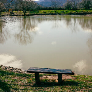
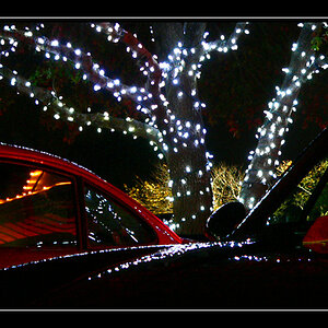
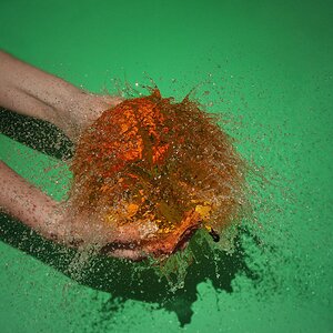
1.
31767_10150218795300601_874590600_13197181_1927292_n.jpg


2.
31767_10150218795355601_874590600_13197186_7810472_n.jpg


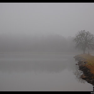
3. This one was to show solitude and sadness.....I think it worked out
31787_10150218795995601_874590600_13197205_2742518_n.jpg


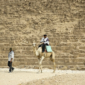
4. Optical illusion ? or walking on water
31767_10150218795235601_874590600_13197176_1925558_n.jpg


here is a little extra ( not for rating) of the ''making of'' my assistant and model, with the setup. Note that we were standing on a 2 foot wide beam, over 50 feet of nothing!!!!

30037_10150218136420601_874590600_13174769_6569900_n.jpg
 
Last edited:
I really like the "solitude and sadness" one ... Great composition and I def. had the feeling of "alone-ness" before I even read the text :)
 
Thanks, dont be afraid to tell me about waht i need to improve! I always appreciate the negative comments as they help me get better
 
Anyone wants to give their opinion before this thread becomes lost :p
 
#4
I would try to crop a little off of the trees, they sort of hide the very small people. I would also take a little off of the bottom. Try that and lets see what happens.
 
1) what were ur white balance settings here? seems off to me.
2) coool
3) def a good title for this photo. good work here. giving a mood always makes a photo.
4) like the illusion. very trippppy. :) again crop work here
5) doesn't do anything for me..looks like a snapshot
 
I think they r very pretty. I would have liked to see her right shoulder in #1 and # 3 would have projected her sadness more if her head was looking slightly down. To me she is looking in front of her and I just think she is contemplating something like gosh I'm bored and have no friends. If she was looking down a bit then she would be thinking I'm alone with no friends and that hurts. See what I mean?
 
I'll try to look past how easy your model is on the eyes.

Her clothes are not really ideal for a shoot. Why the bag? Her earrings are cool, but the electric guitars don't really fit the theme of a beach setting.

1) Gold reflector? Too much I think. The yellow channels are clipped, same as a blown highlight. If it were RAW it could be tweaked and made better, but jpeg's tough. I edited it a bit, posted below. Good shot though, this is my favorite of the bunch.

2) I don't like the framing very much. I see what you're going for, having the space off to the side where she's looking. I find the background too distracting though, especially the dark horizontal line in the water.

3) Not bad. I like it, I think I might like it more if you had stepped back some and placed her deeper into the bottom-right corner of the frame.

4) This is just a cool shot. Great capture.

5) I don't know if I'd be smiling if I were that high up... :p

Good work thanks for sharing.

EDIT: Almost forgot, here's my edit on #1. It's not great but I tried to remove some of the warmth without destroying it..

QopQR.jpg


Here's a 'creative' edit with some cheesy RGB curves and a white vignette...
Some people like this stuff, most don't. I still haven't decided what I think.
wfui4.jpg
 
Last edited:
I'll try to look past how easy your model is on the eyes.

Her clothes are not really ideal for a shoot. Why the bag? Her earrings are cool, but the electric guitars don't really fit the theme of a beach setting.

1) Gold reflector? Too much I think. The yellow channels are clipped, same as a blown highlight. If it were RAW it could be tweaked and made better, but jpeg's tough. I edited it a bit, posted below. Good shot though, this is my favorite of the bunch.

2) I don't like the framing very much. I see what you're going for, having the space off to the side where she's looking. I find the background too distracting though, especially the dark horizontal line in the water.

3) Not bad. I like it, I think I might like it more if you had stepped back some and placed her deeper into the bottom-right corner of the frame.

4) This is just a cool shot. Great capture.

5) I don't know if I'd be smiling if I were that high up... :p

Good work thanks for sharing.

EDIT: Almost forgot, here's my edit on #1. It's not great but I tried to remove some of the warmth without destroying it..


Here's a 'creative' edit with some cheesy RGB curves and a white vignette...
Some people like this stuff, most don't. I still haven't decided what I think.

thanks for the comments, first of all the reflector was a silvery one and not gold.

As for the clothing, well the girl has her own style, and she paid for the shooting might as well show her on her true side :) .

I was shooting in raw, but these images were on my facebook and well, lets say the quality gets cut out there, but i see where your going and ill check that out.


as for other questions my white balance was on daylight and post processed when needed ( cooled down or heated up)


as for the guitars, why not :D

thanks everyone , keep those comments coming!
 
For #3 I think cropping out some of the dead space on the right would really help.
 
I think the cropping is perfect on #3 tbh, any more would obviously be showing too much and your model would look a bit lost in it all, and any less i think she would just be filling the shot too much.

I love the last one, just looks like a really nice fun moment that was well captured
 

Most reactions

New Topics

Back
Top