Ad in Playbill?

DGMPhotography

Been spending a lot of time on here!
Joined
Mar 23, 2012
Messages
3,160
Reaction score
718
Can others edit my Photos
Photos OK to edit
Hey there,

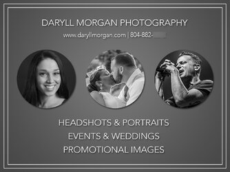
So I got a half page (3.75x5) ad space in my local theatre's programs as part of our contract. Just wanted to get some feedback on my design. And it's being printed in black and white.

DaryllMorganPhotography2.jpg
 
I like the simplicity. Too much tends to bore the potential victim.......... err......... I mean, customer.

No phone number?

BTW, congrats on 2k posts.
 
I like the simplicity. Too much tends to bore the potential victim.......... err......... I mean, customer.

No phone number?

BTW, congrats on 2k posts.

Oh wow! Didn't even realize. haha, thanks!

And yeah, I agree - I wanted to keep it simple. I thought about adding my number, but that's on my website, so I wasn't sure if even that would be necessary. I'm open to other ideas, though.
 
Not everyone uses modern technology. I have 3 neighbors near me who don't even own a computer or use cell phones.

On the flip side, I would add a QR code.
 
Not everyone uses modern technology. I have 3 neighbors near me who don't even own a computer or use cell phones.

On the flip side, I would add a QR code.
Wow.....Just wow. I am sorry, I thought that Iowa meant the state in the US. I didn't realize it stood for In Outer West Azerbaijan.:biggrin-93:

It doesn't. It stands for Idiot Out, Walking Around.

Boy, you flat-landers sure are unedyookayted.
 
Its a well put together ad.

You drive for an hour at night and pass hundreds of cars. One car passes you with no lights on and you notice it. I think the same applies to ads. I would not notice your ad as it is basically the same as every other ad I have ever seen for a photographer.

Here is another version. Which version would you notice???
flyer1.jpg
 
From my old newspaper days. The eye tends to move in a slight upward arc from the top left corner to the bottom right corner in an ad. The further copy is from the line the less likely it will be seen or remembered unless someone stops and actually studies the ad. Also the more ways you provide for someone to contact you (telephone, email, text, Web, location) the better your total response will be. While simplicity in an ad is beneficial, you have to include the key points that will entice someone to call you.
 
Its a well put together ad.

You drive for an hour at night and pass hundreds of cars. One car passes you with no lights on and you notice it. I think the same applies to ads. I would not notice your ad as it is basically the same as every other ad I have ever seen for a photographer.

Here is another version. Which version would you notice???
View attachment 128102
Haha, that's a good point.. I'm just not sure what else to do to make it stand out? Any ideas? Aside from absurdity? And I will add my number - thanks, y'all.
 
Alright, here is an updated version... I still don't know what to do to make it more eye catching, but compared to the plain text that the rest of the program will be made up of, I feel like it will stand out either way. They don't even plan to include photos of the actors in it.

DaryllMorganPhotographyBlur.jpg

And for the smart alecs, yes, my number is blurred, and no, that's not part of what the actual ad will look like.
 
The middle shot looks like he's eating her face. You should hire a professional graphic artist to design the ad for you.
 
The middle shot looks like he's eating her face. You should hire a professional graphic artist to design the ad for you.

1) A professional graphic artist wouldn't have anything to do with the photo, as I am the one that took the photo. And 2) I would, but I don't have the time for that, we're on a tight deadline.

If no one else wants to offer constructive suggestions, I'll just send in what I think works best. Thanks yall.
 
for what it is, its fine with the phone number added.
for something like this, simple is good, and your design gets the main points across just fine.
its lists email and phone. i would just go with it as-is
 

Most reactions

Back
Top