You are using an out of date browser. It may not display this or other websites correctly.
You should upgrade or use an alternative browser.
You should upgrade or use an alternative browser.
Additional C & C please
- Thread Starter ebp
- Start date
- Joined
- Apr 9, 2009
- Messages
- 41,401
- Reaction score
- 5,706
- Location
- Iowa
- Can others edit my Photos
- Photos OK to edit
You'll get more specific and better C&C if you don't post so many photos in each thread.
I will usually only comment on 1 photo.
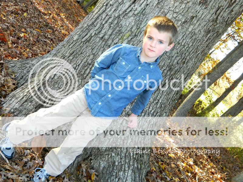
The tilt in #2 doesn't work, because it is to severe. In fact tilting the camera more often doesn't work at all. Get your subjects out of the center of the frame (see rule of thirds - Composition: Using the Rule of Thirds).
Watch out for very bright (hot spots), blown out areas is portraits (#2, #4) caused by dappled sunlight.
MTVision
Been spending a lot of time on here!
- Joined
- Aug 1, 2011
- Messages
- 3,008
- Reaction score
- 527
- Location
- Vermont, US
- Can others edit my Photos
- Photos OK to edit
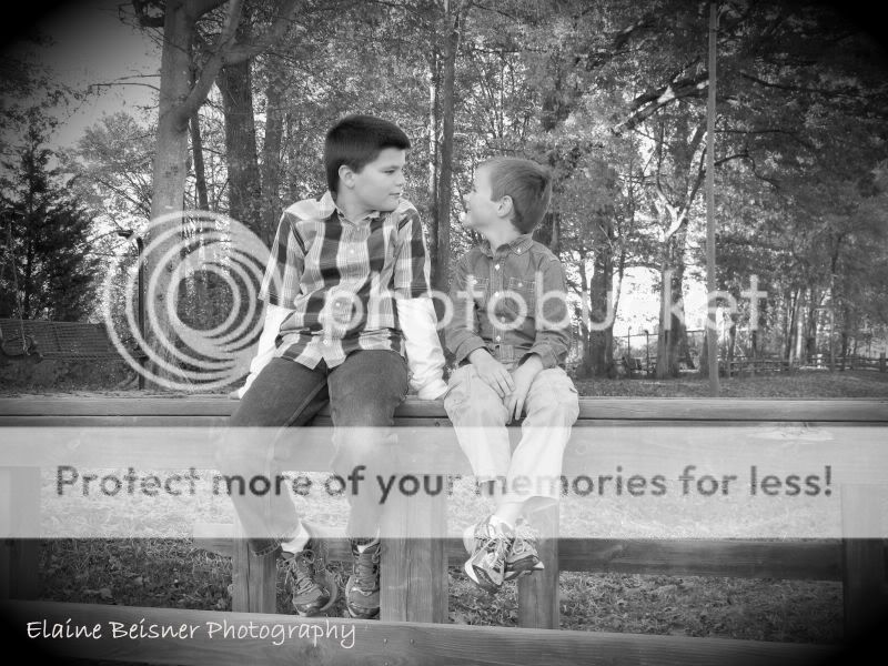
Both b/w photos are a little muddy - add a little contrast to them. If you use photoshop/elements a soft lighting blending mode will add the perfect amount of contrast for both of these.
In #1 I think you could do a tighter crop so the boys fill the frame. The scenery to the sides and behind them isn't all that pleasing - there are benches, picnic tables, etc. that add nothing to the photo.
#2 - I don't feel like that tilt does anything for this picture. Cute little kid though
#3 - needs some contrast but its a cute shot. Who doesn't love baby feet!
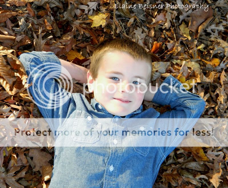
#4 - he is really centered here. If you crop out some of the empty space at the top of his head you could get this picture to follow the Rule of Thirds by placing his eyes 1/3 of the way down the frame. He's got some hot spots on his skin.
#5 - the couple is once again pretty centered in the frame. It seems a tad underexposed but it could just be me..
photo guy
TPF Noob!
- Joined
- Jan 9, 2011
- Messages
- 841
- Reaction score
- 20
- Location
- western wisconsin
- Can others edit my Photos
- Photos NOT OK to edit
- Banned
- #4
I like the last photo the best. Nice colors, nice message, nice focusing.
WesternGuy
Been spending a lot of time on here!
- Joined
- Dec 23, 2010
- Messages
- 5,281
- Reaction score
- 1,219
- Location
- Calgary, Alberta, Canada
- Can others edit my Photos
- Photos NOT OK to edit
Further comments - my 0.02¢ worth FWIW...
#1. Not bad, not sure I like the vignette, but then that is just me - how did you do the conversion? I like my B&Ws to have a bit more contrast and tonal range, that's my only nit.
#2. As I said in your previous post, not a fan of tilted shots - just doesn't work for me - that's all.
#3. IMO, just a snapshot of two feet and it is a bit fuzzy.
#4. Cute kid - nice smile - but you have him centred in the frame - as has been noted, Rule of Thirds and other compositional things. This one is better than the previous one IMO.
#5. Nice colours - maybe a tad underexposed, but still I like it. The curving path leads the viewer's eyes through the image to the couple. Again - centre placement - I would have placed them a bit to the left and down towards the lower third of the image. On second thought, centred is not too bad in this case - they are the main subject of the image and maybe this is one of those "exceptions" to the rule sort of thing...
You would do well to read up on composition, particularly as it relates to portraits or "people" pictures. For example, for kids: Mamarazzi: Every Mom's Guide to Photographing Kids: Amazon.ca: Stacy Wasmuth: Books, and here: Top 10 Children Photography Tips PictureCorrect. If you Google some combination of children and photography, you will find more than you can look at in a week...:thumbup:
For general composition, have a look at these:
Composition top 15 ,
Photography Composition Articles Library and
Guidelines for Better Photographic Composition.
There are, of course thousands/millions of sites on the web that deal with photographic composition in some way or another. HTH.
Cheers,
WesternGuy
ebp
TPF Noob!
- Joined
- Nov 12, 2011
- Messages
- 6
- Reaction score
- 0
- Can others edit my Photos
- Photos NOT OK to edit
- Thread Starter 🔹
- #6
Thank you so much for the help! I don't have PhotoShop so I've been using pixlr for some and gimp for others, then changed to b/w from there. I'm still learning the ins and outs of pp editing as you can see.  I'm also saving up for an entry level dslr but am trying to get the hang of the other aspects of photography until then. I see what you mean about the Rule of Thirds. Now I just have to bribe my kiddos with ice cream to let me take another photo shoot.
WesternGuy
Been spending a lot of time on here!
- Joined
- Dec 23, 2010
- Messages
- 5,281
- Reaction score
- 1,219
- Location
- Calgary, Alberta, Canada
- Can others edit my Photos
- Photos NOT OK to edit
You don't need Photoshop, unless you are talking about Photoshop Elements. You can probably get it for less than $100 at places like Costco. It will be all you will probably ever need for at least 4 or 5 years. When I started, about 6 -7 ± years ago in digital photography, I started with Elements Version 4, went to version 6 and them 8, then about 2 years ago I moved to Lightroom, primarily for its image management capabilities, but I still find that about 80+% of images can be handled by its Develop module. I do have Photoshop CS5, but I do not use it that much and for someone to try and learn it from scratch puts them on a long learning curve - it has over 500 menu commands alone - remember it was originally "designed" for graphic artists and photographers grabbed onto it when there wasn't much else out there and some have stuck with it, not only that, it is quite a bit more money than Elements. You can download a copy of Elements from the Adobe web site and try it free for 30 days and even buying it direct from Adobe is not that expensive - Adobe Photoshop Elements 10, but do shop around.
You can also find a lot of tutorials for it on the web and there is a very good forum for elements - Elements Village - Powered by vBulletin. This is run by folks who also publish a"newsletter" every couple of months so some of the sites are limited to subscribers (cost $$), whereas some, like the forum, are open to the public.
Elements comes with an Organizer, which is type of Library module that you can use to organize your images and keyword them for future reference. All I can say is try it, you might like it. There are also a lot of "add-ins" for Elements that are available on the web - some are free, some are shareware and others cost $$. Start with the basics and grow from there. HTH.
Cheers,
WesternGuy
Similar threads
- Replies
- 7
- Views
- 310
- Replies
- 2
- Views
- 145


![[No title]](/data/xfmg/thumbnail/36/36299-468f060314a0ac2bf5e37da1c33149d2.jpg?1734168618)

