Demers18
TPF Noob!
- Joined
- Nov 11, 2011
- Messages
- 1,330
- Reaction score
- 265
- Location
- Sudbury
- Website
- www.flickr.com
- Can others edit my Photos
- Photos OK to edit
Here are few shots from the past couple of weeks.
I've been working on composition and exposure.
I look forward to your feedback.
#1 Home is Here - I was going for the cool winter effect
 [/URL] _MG_0431 by lee.demers, on Flickr[/IMG]
#2 Bark and shadow
 [/URL] _MG_0464 by lee.demers, on Flickr[/IMG]
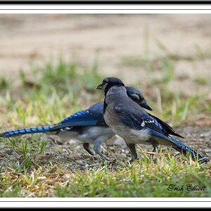
#3 Winterblue
 [/URL] _MG_0473 by lee.demers, on Flickr[/IMG]
#4 Here comes the storm...
 [/URL] _MG_0493 by lee.demers, on Flickr[/IMG]
#5 Icy
 [/URL] _MG_0518 by lee.demers, on Flickr[/IMG]
#6 This one is my favorite one of them all... Don't know what it is, I find it captivating
 [/URL] _MG_0526 by lee.demers, on Flickr[/IMG]
I've been working on composition and exposure.
I look forward to your feedback.
#1 Home is Here - I was going for the cool winter effect
#2 Bark and shadow
#3 Winterblue
#4 Here comes the storm...
#5 Icy
#6 This one is my favorite one of them all... Don't know what it is, I find it captivating
")


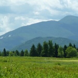
![[No title]](/data/xfmg/thumbnail/34/34115-73b827c6a6db1413dcead11e4caaae69.jpg?1619736285)


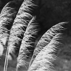
![[No title]](/data/xfmg/thumbnail/33/33030-2d80455c47ebf5f145e0bd5064267aea.jpg?1619735844)