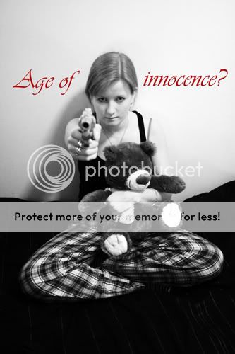
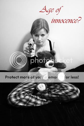
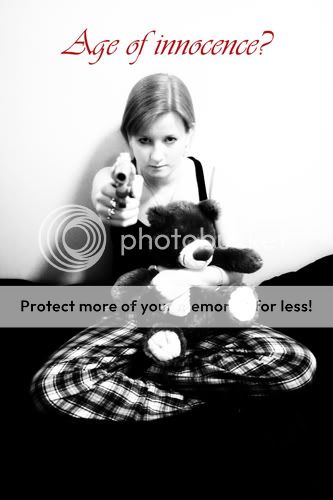
These are great. i like the wording above her head in c. and i like the exposure best in b. The exposure in b is the most realistic and emotionally dark. Great job.
I like C but in all cases I would use a differnet font. Something deconstructed or at least that had more weight to it. Like the contrast of the red with the black and white.

")


![[No title]](/data/xfmg/thumbnail/35/35264-5ade32b7036391926536661aeb7491c3.jpg?1619736969)


![[No title]](/data/xfmg/thumbnail/35/35265-c9ea3efd2c618a57ea136e63ad106880.jpg?1619736970)