All hat, no cattle

The_Traveler

Completely Counter-dependent
Supporting Member
Joined
Dec 11, 2006
Messages
18,743
Reaction score
8,047
Location
Mid-Atlantic US
Website
www.lewlortonphoto.com
Can others edit my Photos
Photos NOT OK to edit
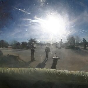
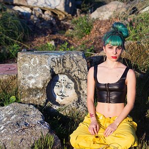
I like this because, to me, it is composition over content - almost
Asian in simplicity. The lack of any real content should make it impossible for viewers to respond to anything but the design.

(Yes, B&W is a possibility also.)

12413-WallFrederick___2007-06-24_2834-.jpg
 
well., . . this photo really confuses me. i don't know if i like it or not yet.

but i do think i might like it better in bw. i feel like there is TOO much dead space in comparison with the elements. the curving of street and sidewalk i find quite unsettling, and thought at first crop it. but think not, bc there would be even less in the photo.

i can't get much further than that in my critique, and i guess i'll finish up saying if i had to give it a yes or no i'd give it a no for now.
 
7985-12413-WallFrederick___2007-06-24_2834-.jpg


Crop
Crop To: rectangle
Top: 0.012 inches
Left: 0.079 inches
Bottom: 2.337 inches
Right: 1.667 inches
Angle: 0°
Target Width: 0 pixels
Target Height: 0 pixels
Target Resolution: 0 per inch
Brightness/Contrast
Brightness/Contrast Brightness: -15
Contrast: 32
Select burn
Burn Tool
Undo
Burn Tool
Hue/Saturation
Hue/Saturation Without Colorize
Adjustment: hue/saturation adjustment list
hue/saturation adjustment
Hue: 0
Saturation: 27
Lightness: 0
2007-06-25T10:28:31-04:00 File -.jpg saved
Save As: JPEG
Quality: 9
Matte: none
In: C:
Unsharp Mask
Unsharp Mask Amount: 68%
Radius: 1 pixels
Threshold: 0
2007-06-25T10:28:55-04:00 File -.jpg saved
Save

And what I did.....Comments?
 
I am a little disappointed that there was little talk about the picture itself and so much about the corrections I should make.

Why make those edits and what will it do?
 
Let me attempt to expand.

The idea is very good, because it really leads your eye around the photo and the negative space contributes nicely. In this photo you have a lot of straight lines, the bricks, window, the window panes individually, the cement sidewalk, etc. This curved driveway really doesn't fit this, do you think? Also by eliminating it you are having a solid color "background" for the stars, faucets, and windows. All beige.

PNA's edit eliminates the curve, and also enhances the lines of the bricks. By making the lines more prominent in the bricks, there is more texture. It also feels warmer in the edit. Hope that helps.

____

That being said: I also don't understand why Jeff's post was deleted when he just said a negative version of what Mike said. It's his opinion, not arguing.

Eric.
 
I am a little disappointed that there was little talk about the picture itself and so much about the corrections I should make.

Why make those edits and what will it do?

I thought the idea behind this thread was to offer criticism in a constructive way. The edits listed give the results that I posted. You have every right not agree with my editing, but I have offered it for your consideration. If you are offended by my editing, suggestions and criticisms, my apologies to you sir....

If you don't care for me to edit you shots, I suggest you alter your signature to the red notice.
 
If you are offended by my editing, suggestions and criticisms, my apologies to you sir....

I'm not offended at all, I just want to know what you actually think about the picture and why you want to make the edits.
 
The idea is very good, because it really leads your eye around the photo and the negative space contributes nicely. In this photo you have a lot of straight lines, the bricks, window, the window panes individually, the cement sidewalk, etc. This curved driveway really doesn't fit this, do you think? Also by eliminating it you are having a solid color "background" for the stars, faucets, and windows. All beige.

PNA's edit eliminates the curve, and also enhances the lines of the bricks. By making the lines more prominent in the bricks, there is more texture. It also feels warmer in the edit. Hope that helps.

Eric.

Thanks for the explication of your thoughts - altho I respectfully disagree. IMO, the curve is discordant and so adds a vital something to what would otherwise be too bland. (Sort of the way that white cheese and guava paste go great together)
 
I guess I'm too old to "get this". I see a wall with some stars on it. An offwhite wall at that, with an off white sidewalk, and an off white street. The only color in the photo is a crooked window, and some rusty pipes.
But hey, I'm just an old fart, and I don't normally "get" what my kids would think is artistic.
Please take this as just an old woman's opinion. Thanks for sharing.
 
I'm not offended at all, I just want to know what you actually think about the picture and why you want to make the edits.

There are others who have express opinions regarding you photo. Please consider their observations my reasons for editing your photo. The list of actions I provided are merely to demonstrate what steps I took using PhotoShop to achieve the edit.
 
You are well within your rights....!!!:D

Does that mean you prefer the original????

No, IMO, yours just seem to tight too me on the bottom, why I’m not sure, maybe that a foolish reason, but the color tweaking helped


I am a little disappointed that there was little talk about the picture itself ---

Lou, I’m Ok with composition of the open space, but I think the colors and contrast need tweaking as PNA subjected, and maybe even a high contrast BW would be good, Simple subjects are the hardest deal with

Hope no one is offend
 
Well this is the kind of shot that I guess could grow on ya ...

I think what doesn't work for me is the color... the shot for me , I guess would fall short of artsy, and into a abstract category?? You mentioned , composition over content?? Which I don't understand ?? I have to totally love a scene before I can even begin to think composition.. if I don't love the subject I shoot, I walk away ? so not sure what your saying ??

I to think B+W on this shot..

The rework is very nice as it does seem to highlight more detail and texture..
 
I am a little disappointed that there was little talk about the picture itself and so much about the corrections I should make.

Why make those edits and what will it do?

agreed. the guidelines and references clearly indicate that a critique is what is needed in this forum for the benefit of all. simply seeing an edited image does nothing for the learning environment.

the posts that are merely edits with no real valuable critique will, henceforth; be tagged.
 
the posts that are merely edits with no real valuable critique will, henceforth; be tagged.

You do not consider the detailed description of the PhotoShop actions "valuable critique" information?????:confused:

It appears you are not allowing for any discussion among member posters judging or editing a photo.....!
 

Most reactions

Back
Top