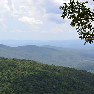
I like this, but it seems like the sky is more the subject than the wonderfully detailed bottom third. My suggestion would be a landscape oriented crop and really let the details and colors shone!
I think it's quite nice as is. You do need to view it big, and the very subtle colors in the sky really are what makes this work. It's about the contrast between the sky and land, and it hits that note quite hard and effectively. Portrait is a little odd here, but I think it succeeds.
I think it's quite nice as is. You do need to view it big, and the very subtle colors in the sky really are what makes this work. It's about the contrast between the sky and land, and it hits that note quite hard and effectively. Portrait is a little odd here, but I think it succeeds.
Could it not have the same impact if the plain white at the top was gone? I assumed it would look better larger, but at first sight, all I see is a large chunk of white, then about a 1/4 to a third down starts this wonderful fade of colors. Square would do it justice IMO.
I am perhaps a bigger fan of negative space than most people. To me, this one is about the relative blankness of the sky, contrasting with the busy monochromatic land. Tradition suggests putting the horizon at a one third line, and I agree with that idea here. The sky needs the room to breathe, being so flat, to counterbalance the black tones and busyness in the foreground.
That's just my read though, and certainly doesn't invalidate what anyone else sees in it.
This is precisely what I was trying to portray. I did try the crop during post and it didn't work as well for me. I like balance the negative space in the sky offers. It helps soften the image as whole. I chose the portrait view for this particular reason and the fact that it differs a little from the typical "landscape" shots.
I guess you could call it a little bit of experimenting.


 I'm not a fan of rules!