Be very careful with your angles. There is not one image where the horizon is straight, not saying its a bad thing, but when overdone it's a negative imo.
OP, come on, you know the images are nice and Geaux is absolutely right, going crazy with the angles only detracts from the nice images. Maybe in one or 2, but not the entire set. Gorgeous models...nice
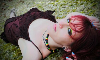
very nice edits. I'll beat the dead horse. angles, angles, angles. They look nice in 2 and 4 but #3 just looks bad. Don't over do the vignetting either. Looks good though
I really like each image as an individual image, but I agree the tipped horizon is overdone. What bothers me more is the white balance shift between some of the shots. The skin tones are changing markedly. Not a problem viewed separately, but viewed together its odd...Really nice stuff though!
I've never paid attention to horizon before. I've always liked different angles. But I'm going to focus on horizon more.
I appreciate all the feedback. ☺
I've never paid attention to horizon before. I've always liked different angles. But I'm going to focus on horizon more.
I appreciate all the feedback. ☺
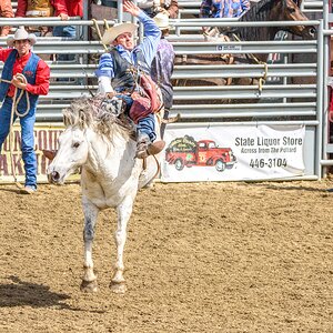
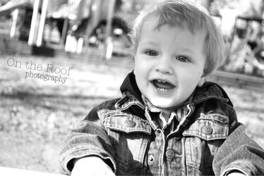
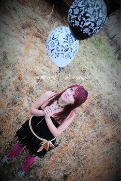
Angles can be used to advantage, but are often over-done. IMO, the only one where the angle really works is the one with the young lady leaning against the old truck. In the others, there are obvious vertical elements (treees, balloons) which look visually awkward at an angle, and in the monochrome, the angle is slight enough that it seems accidental rather than intentional.


")