forrey
TPF Noob!
- Joined
- Oct 21, 2011
- Messages
- 31
- Reaction score
- 2
- Location
- Ann Arbor, MI
- Website
- www.forrestmckinney.com
- Can others edit my Photos
- Photos NOT OK to edit
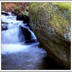
A friend of mine who's a cellist asked me to take some photos/make a poster for his upcoming recital so I managed to drag him out into the woods today and get some shot. Haven't processed all of them yet, but these are my favorite 3 so far.
Would love to hear feedback on these! feel free to be brutal
1.
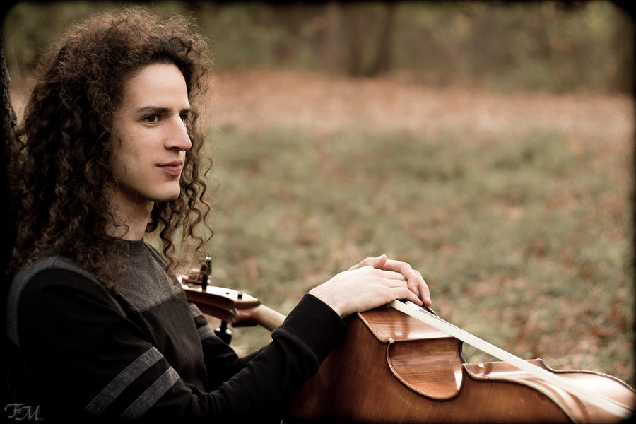
2.

3.

Would love to hear feedback on these! feel free to be brutal
1.
2.
3.


![[No title]](/data/xfmg/thumbnail/39/39294-339c772c727b255b9451f2639f2bc28e.jpg?1619738959)