Anatomy of a profesional lifstyle/product shot.

y75stingray

TPF Noob!
Joined
Jan 18, 2010
Messages
189
Reaction score
15
Location
Detroit MI
Can others edit my Photos
Photos OK to edit
Thought i would take a moment and post my workflow for a recent shot i did. Please check out the entire project here.


Breed watches Photography and copy on Behance

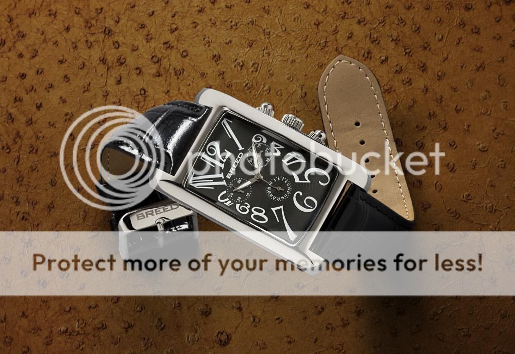
Here is the finished piece.

breedgatsby.jpg


First some snapshots of the lighting


IMAG0025.jpg


IMAG0026.jpg


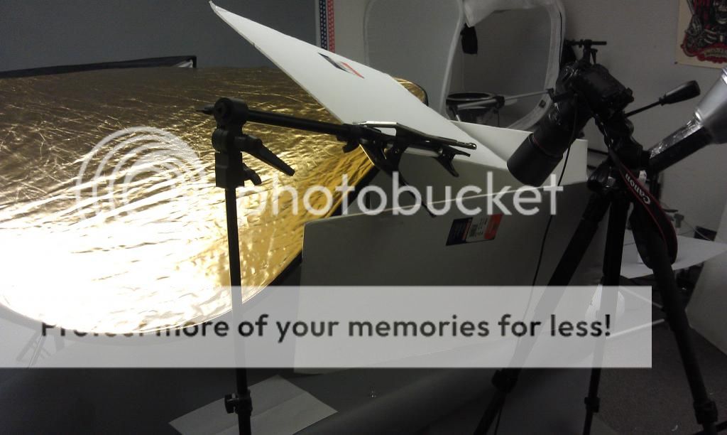
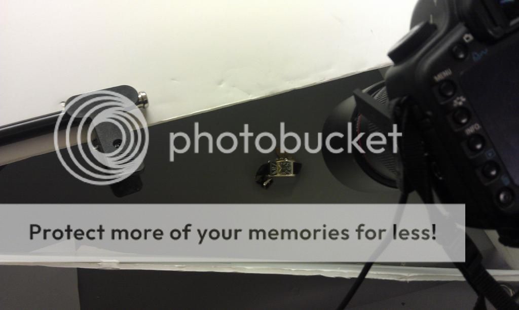
Notice all the white cards, and reflector. Im lighting it with strip boxes that are positioned to the left and rear of the subject. the cards and reflectors work as fillers to distribute the light more evenly. They also get rid of unwanted black blotches in the steel.

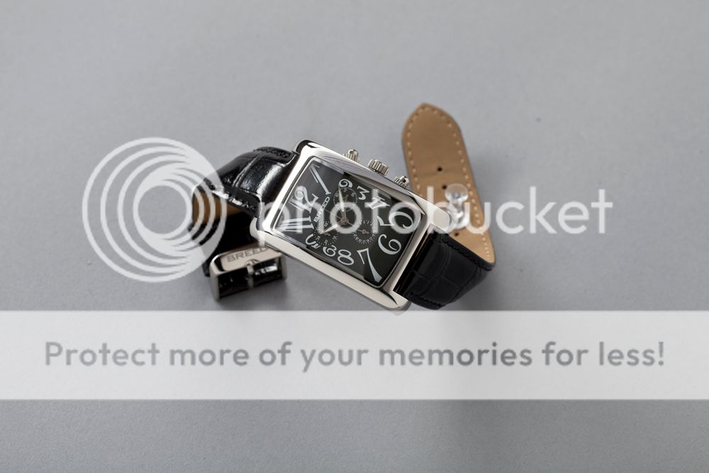
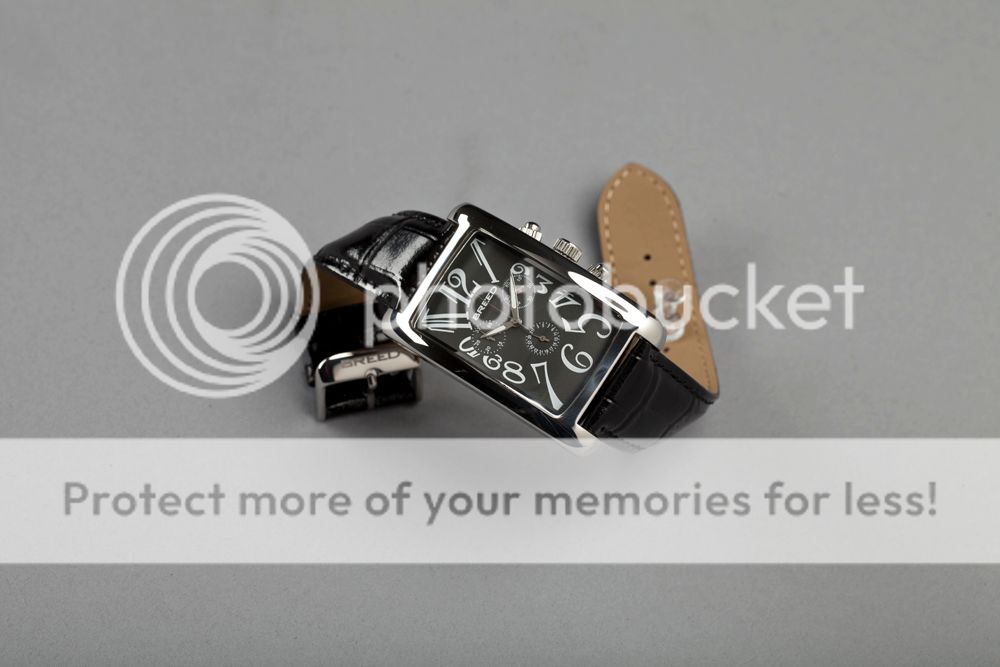
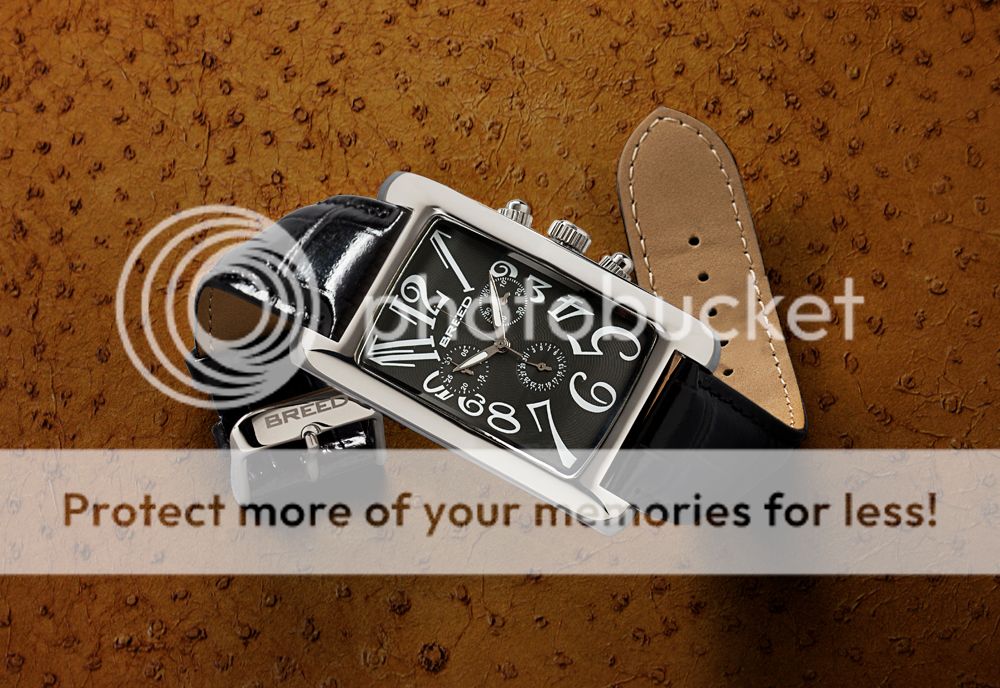
I focused stacked this shot so more than one shot was used. I also borrowed pieces of different shots with the cards in different places to get the best looking face and steel possible. Here are the images i used.

3-1.jpg


2-1.jpg


1-1.jpg


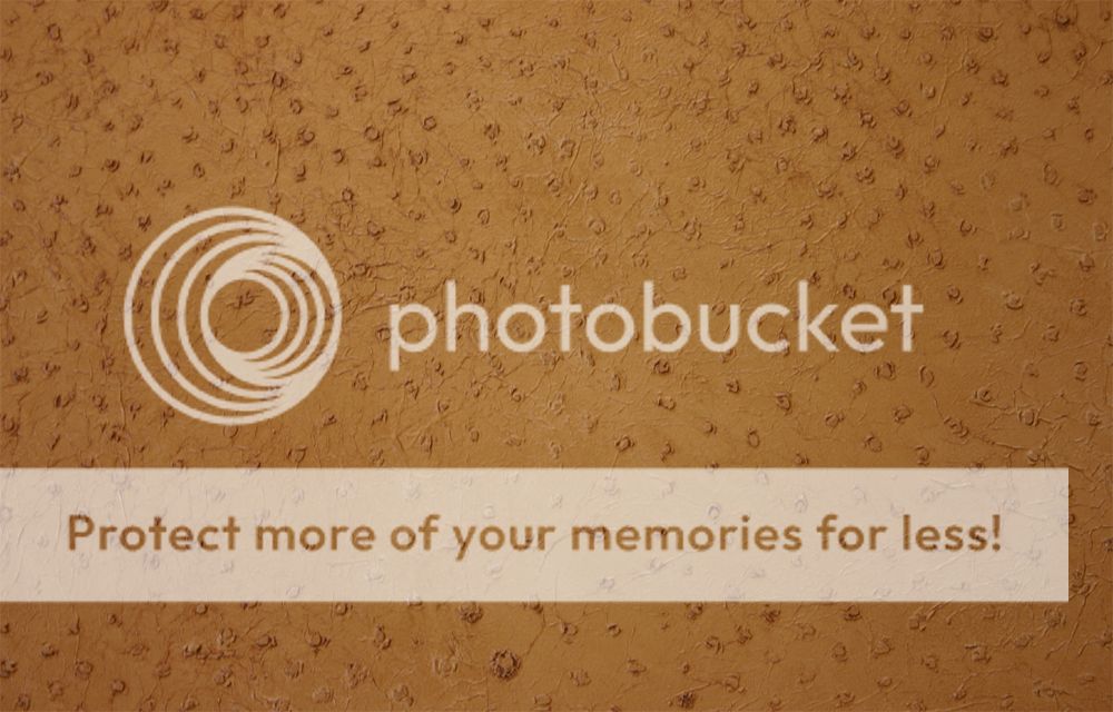
I then added a ostrich leather background that was shot separately.

ostrich.jpg


4-1.jpg


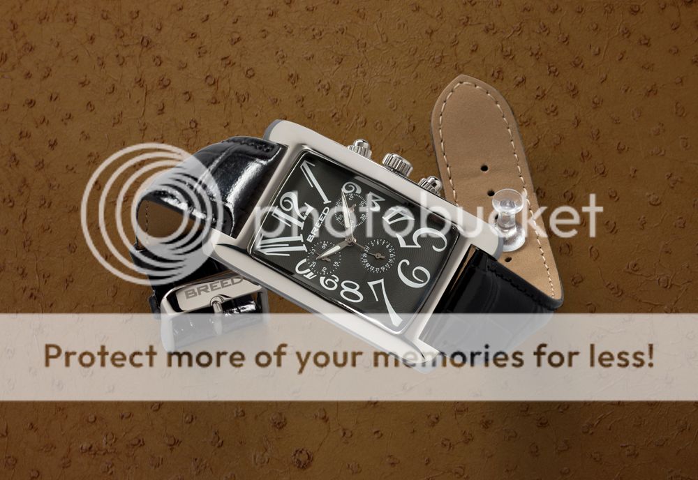
blended it, and removed the pin.

5-1.jpg


Then just some final touches.

breedgatsby.jpg


You like?
 
Last edited:
Thanks, The whole process took me about four hours. two to shoot it two to edit it.
 
Do you want a pat on the back or do you want real criticism?

If you want real criticism, I'll be back in about an hour an half.
 
Do you want a pat on the back or do you want real criticism?

If you want real criticism, I'll be back in about an hour an half.

Sure c+c this bad Larry, but keep it constructive. we're all here to learn new things right?
 
It's not that bad unless you tell me you have 10-20 years of experience, lol.

I'll start with the finished image, the first one you showed (as it should be, I think):
The tone of the Ostrich background is ok. It seems a bit dark to me but that is a matter of choice. The watch face is very nice and you set it to the right time. The Brand name is very crearly readable. It could be better but it is not bad at all. The inside of the wrist band is very nice on the right.

However, the inside of the wrist band on the left is non-existant. Way too dark when it should be the same tone as on the right.

There are weird shadows. Bottom right and to a lesser extent, bottom left. Those should not be there. Strong shadows can be fine so long as they look like they belong. In this case, they don't. They look like you didn't know how to get rid of them.

And, the worst part, the dark part of the wristband sowing on the right has absolutely no detail.

As for the rest of the images, they show differents sets of shadows, at least one of which is better that what you chose. I also think there is a better tone to the ostrich in the other images. Again, that is personnal.

Like I said, unless you tell me you have a whole bunch of experience, this is not bad. It is not however a selling image in my world.
 
No I'm not a 20 year veteran picked up my first dslr in 2010 so I'm always happy to hear a critique. It definitely helps to have new opinions to work from.

I gotta say I like the strong shadows. That's why I raked the light to achieve those in the first place, but to each there own. I suppose I overlooked the inside bottom of the left band as you said, but really there isn't much information there to show the viewer. I feel added light there would take away from the contrast of the image.

Thanks again for your c+c I will keep it in mind on my next project.

If you or anyone else reading happen to be skilled in this genre and have steps of workflow from start to finish available I would love to see it!
 
Thank you very much for your detailed description of obtaining this shot, very generous.. It is far, far better than anything I could produce, but I learned a lot from you and those that gave CC. Again thank you, and a great product photo. I hope you will continue with these types of posts as they are a great contribution. I wish more posters would do the same.
 
I gotta say I like the strong shadows.

So, you don't have anything to learn. Good for you. And good luck.


ummmm, no... I just happen to like the shadows for this particular piece. I look forward to learning much more, as much as possible. Please post an example of your work I would love to see it. I'm being sincere, not condescending or sarcastic.
 
I liked it more in the second to last edit. It had a much warmer tone to it and that gives the picture a lot more personality than the last shot.
 
The one thing i want to see is the detail on the front of the strap not the back that will never be seen when worn
 

Most reactions

Back
Top