
AprilRamone
TPF Noob!
- Joined
- Nov 3, 2005
- Messages
- 1,280
- Reaction score
- 2
- Location
- Denver
- Website
- www.apriloharephotography.com
- Can others edit my Photos
- Photos OK to edit
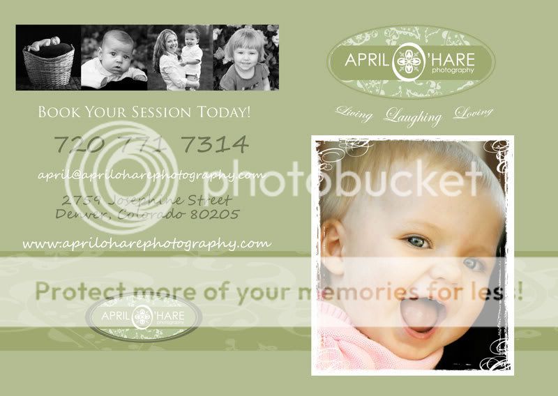
I have a school auction coming up and in addition to an 11x17" framed photo, business cards, and my flyer for the Childrens Photo Contest I have every year I decided to make a brochure with more examples of my photos as well as some information about my studio and what we have to offer.
I didn't put prices on it as I may be changing them up again and didn't want these to go to waste if I didn't use them all at this auction.
Thoughts? Suggestions?
It will be a folded over two page type of brochure with a front and inside and back cover:
Front Cover is on the right, Back cover is on the left
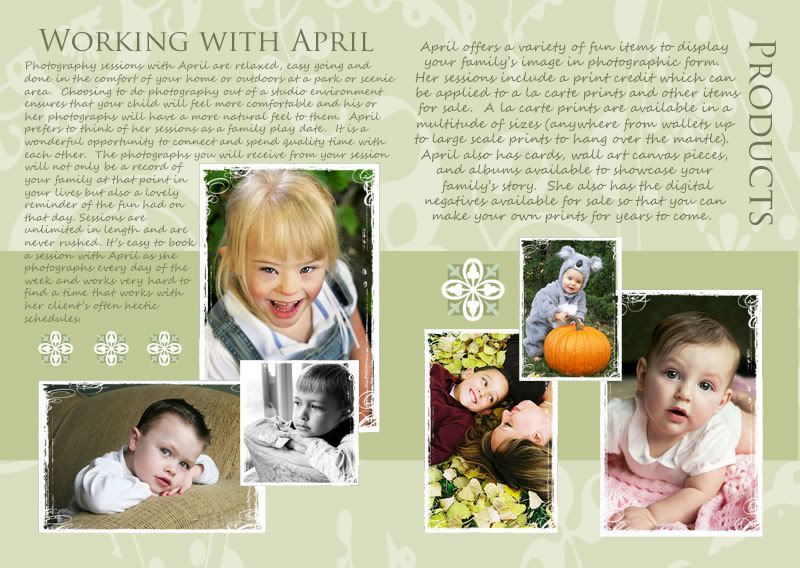
And this is the inside:
I didn't put prices on it as I may be changing them up again and didn't want these to go to waste if I didn't use them all at this auction.
Thoughts? Suggestions?
It will be a folded over two page type of brochure with a front and inside and back cover:
Front Cover is on the right, Back cover is on the left
And this is the inside:

![[No title]](/data/xfmg/thumbnail/32/32177-3a3d923fa1584c6ef7d6602aaa24fbc6.jpg?1619735235)
![[No title]](/data/xfmg/thumbnail/30/30878-f33da8abe01acde1dcee7898f41310e1.jpg?1619734493)


![[No title]](/data/xfmg/thumbnail/34/34137-37e6e29a844c1214e5b14ce322c7b716.jpg?1619736309)
![[No title]](/data/xfmg/thumbnail/32/32178-010a47bfeb945bdafb02b0ee4888290c.jpg?1619735235)
![[No title]](/data/xfmg/thumbnail/32/32176-48b4ba2fc0e35afa267c5882154e7620.jpg?1619735235)