Navigation
Install the app
How to install the app on iOS
Follow along with the video below to see how to install our site as a web app on your home screen.

Note: This feature currently requires accessing the site using the built-in Safari browser.
More options
You are using an out of date browser. It may not display this or other websites correctly.
You should upgrade or use an alternative browser.
You should upgrade or use an alternative browser.
Another try at the crown.
- Thread starter mpdc
- Start date

skiboarder72
No longer a newbie, moving up!
- Joined
- Jan 17, 2005
- Messages
- 2,111
- Reaction score
- 82
- Location
- Greenville, SC
- Website
- www.joshjonesphoto.com
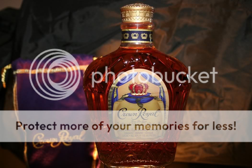
i would have the background take up the whole shot in the first, and maybe ad some backlight, im no pro thats just what i think
OP
OP
mpdc
TPF Noob!
- Joined
- Feb 6, 2005
- Messages
- 315
- Reaction score
- 0
Flash, plus I am using lighting above, and below the subject. Subject is on a glass table.hammy said:I like the second a lot. How'd you do it?
megapaws
TPF Noob!
- Joined
- Sep 21, 2005
- Messages
- 539
- Reaction score
- 9
- Location
- Toronto, Canada
- Can others edit my Photos
- Photos NOT OK to edit
I like the idea here - the lighting is cool.
I am by no means a pro, I just had a thought as soon as I saw the first image. What if you took a shot with the bag lying next to the bottle... I think that it would give it a bit of a seductive look and make it seem less static. Maybe that's just me.
I am by no means a pro, I just had a thought as soon as I saw the first image. What if you took a shot with the bag lying next to the bottle... I think that it would give it a bit of a seductive look and make it seem less static. Maybe that's just me.
now this is my kinda picture lol!
maybe if you tried what skiboarder72 suggested, and maybe added a glass of crown on the rocks in the composition, but the picutres look great, the lighting in the second one looks great, its just missing that extra lil somthing in the composition
maybe if you tried what skiboarder72 suggested, and maybe added a glass of crown on the rocks in the composition, but the picutres look great, the lighting in the second one looks great, its just missing that extra lil somthing in the composition
Don't want you to think I am being a know it all or anything, this is just my opinion.
These shots need a lot of work. First off, do something about that background, wrinkled fabric just never looks good. When lighting the bottle, do a google search for "crown royal ads", that will give you a heading on what a bottle should look like to make the whiskey look appetising. You don't need to copy it exactly, but it is a good place to start. Actually copying ads is a great way to learn.
What you should try is cutting a silver card to fit behind the bottle, the shape of the bottle and hidden inside the edges of the bottle. Angle that card and hit it with a light, either a gridded down light or some kind of snooted card. You can also experiment with gold cards , depending on what looks best. There are other options to light the bottle. You can cover the back with diffusion material and shoot a light from behind. Everything depends on what works best with the set you have going but the idea is to create a nice golden gradation in the bottle to show the color and purity of the whiskey. For the front of the bottle, your label has a bunch of wrinkles. I am sure you don't want to go buy another bottle so that will have to be a photoshop thing. Otherwise the label is not flattered very well the way it is lit. I don't have a problem with using a hard light like you are using, but play around with the angle of the light to better compliment the label and the cap, probably a slightly lower angle. You also need to add a softer light to give some shape to the bottle. Might I suggest my standard plexi gradation? Take a piece of 2' x 4' semi translucent white plexi and shoot a grid into the center of it creating a circular glow of light. Play with it, trying it on the side, top, bottom, whatever you think looks best.
The bag doesn't look too hot, I think it looks good the way Crown Royal does it, which is slumped down underneath the bottle. I too agree that some whiskey on the rocks would look good, but that has some serious lighting and styling issues you would have to contend with. I don't have a problem with the glass surface.
Can I ask what city you live in?
DC Photo bug
TPF Noob!
Willc73 said:Hey MPDC,
The shots weren't in the critique forum so I didn't want to just give you all my opinions. However I do exactly this type of thing for a living and if you want, I can give you my comments and suggestion?
Let me know.
Please do.
I put some of my stuff in there and they moved them out. I dont want to annoy anyone. But PLEASE anything that would help I would be gratefull.
You learn more from failure than success, what I have learned....(that didnt sound right.)
DC Photo bug
TPF Noob!
megapaws said:I like the idea here - the lighting is cool.
I am by no means a pro, I just had a thought as soon as I saw the first image. What if you took a shot with the bag lying next to the bottle... I think that it would give it a bit of a seductive look and make it seem less static. Maybe that's just me.
Thats an idea...
I like that. The bag was kind of an after thought. thanks
DC Photo bug
TPF Noob!
Willc73 said:Don't want you to think I am being a know it all or anything, this is just my opinion.
These shots need a lot of work. First off, do something about that background, wrinkled fabric just never looks good. When lighting the bottle, do a google search for "crown royal ads", that will give you a heading on what a bottle should look like to make the whiskey look appetising. You don't need to copy it exactly, but it is a good place to start. Actually copying ads is a great way to learn.
What you should try is cutting a silver card to fit behind the bottle, the shape of the bottle and hidden inside the edges of the bottle. Angle that card and hit it with a light, either a gridded down light or some kind of snooted card. You can also experiment with gold cards , depending on what looks best. There are other options to light the bottle. You can cover the back with diffusion material and shoot a light from behind. Everything depends on what works best with the set you have going but the idea is to create a nice golden gradation in the bottle to show the color and purity of the whiskey. For the front of the bottle, your label has a bunch of wrinkles. I am sure you don't want to go buy another bottle so that will have to be a photoshop thing. Otherwise the label is not flattered very well the way it is lit. I don't have a problem with using a hard light like you are using, but play around with the angle of the light to better compliment the label and the cap, probably a slightly lower angle. You also need to add a softer light to give some shape to the bottle. Might I suggest my standard plexi gradation? Take a piece of 2' x 4' semi translucent white plexi and shoot a grid into the center of it creating a circular glow of light. Play with it, trying it on the side, top, bottom, whatever you think looks best.
The bag doesn't look too hot, I think it looks good the way Crown Royal does it, which is slumped down underneath the bottle. I too agree that some whiskey on the rocks would look good, but that has some serious lighting and styling issues you would have to contend with. I don't have a problem with the glass surface.
Can I ask what city you live in?
Washington DC.
Thanks for the input. I shall be playing with these ideas today. (Well as long as my leave gets extended.) if not will be trying shortly. thanks for the input.
Most reactions
-
 408
408 -
 312
312 -
 280
280 -
 270
270 -
 264
264 -
 227
227 -
 196
196 -
 181
181 -
 165
165 -
 152
152 -
 140
140 -
 139
139 -
 135
135 -
 122
122 -
 102
102
Similar threads
- Replies
- 1
- Views
- 449

![[No title]](/data/xfmg/thumbnail/31/31509-b8abaec96e6e375688e269bc89f47652.jpg?1619734858)