thebasedsloth
No longer a newbie, moving up!
- Joined
- Nov 2, 2011
- Messages
- 350
- Reaction score
- 47
- Location
- Glen Burnie, Maryland
- Website
- www.tmarshphoto.com
- Can others edit my Photos
- Photos NOT OK to edit
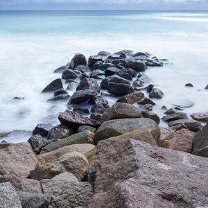
 TMAR6792.jpg by TheBasedSloth, on Flickr
  TMAR6776.jpg by TheBasedSloth, on Flickr
 Is it just me or does the white balance/skin tone on the second look a little off? I just couldnt get it to a point where it looked perfect.. All thoughts appreciated!
")

![[No title]](/data/xfmg/thumbnail/38/38726-c2f92932ae847f22fd6548bf87263976.jpg?1619738702)
![[No title]](/data/xfmg/thumbnail/32/32635-be18e952e67667cbb1525b4b057b6423.jpg?1619735554)
![[No title]](/data/xfmg/thumbnail/36/36650-edd8c21212fe9fbd7e59bfb08cdc91ea.jpg?1619737672)
![[No title]](/data/xfmg/thumbnail/38/38722-8003d9d84f1c7164b5c8f2b884c2e428.jpg?1619738702)

![[No title]](/data/xfmg/thumbnail/37/37126-93feffeca0e9e6ad893962c03a7a341e.jpg?1619737884)