This looks great. Haven't seen many pictures of daily life around spice trading on Kerala coast. Doesn't this take place in Calicut? Is this in your reach? Please post some pictures of this activity if possible.
Hi Charan.... spices...... let me enquire about them... i think in Mattancheri (Kochi, Ernakulam) such trades are blooming... or i will have to move to hill ranges
...and yes, this image is from Calicut, where i stay
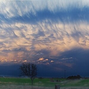
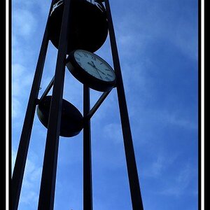
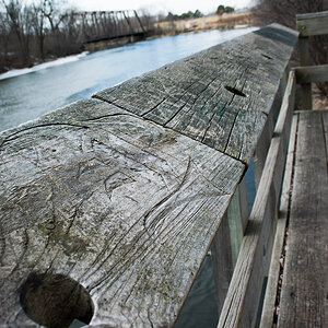
Numbers 3 and 7 are the ones that captured my imagination. I think #7 could use a bit more pop, although it works very well as is. Also, I'd consider cropping just a bit off of the top of the image part of the dark section, which kind of overpowers the pastel tones of the rest of the frame.
Wow, Frequency, I really like these! I think this may be my favorite series of yours!
I'd have trouble picking one favorite, as each one has a very different mood to it.
I'd probably narrow it down to the first three as my favorites. That first one would REALLY rock with that little bit of rope cloned out and maybe the really dark portion in the upper left corner cropped out.
For me it's 5 and 7. 5 could use a little cleaning up - there are some spots that are distracting - and I might even clone out a couple of the reflections in the lower right for better balance.
Excellent, Nandakumar! I vote #3, then #1 (without the rope) and then #7. You "might" want to use a higher f/stop to get some more DOF. But I'm biased - I love reflections on the water!


![[No title]](/data/xfmg/thumbnail/34/34344-0b42e0e92ad436e6710a1b9c4585d6df.jpg?1619736379)