deeky
No longer a newbie, moving up!
- Joined
- Jun 22, 2012
- Messages
- 1,244
- Reaction score
- 415
- Location
- Sioux Falls, SD
- Can others edit my Photos
- Photos NOT OK to edit
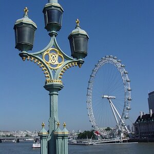
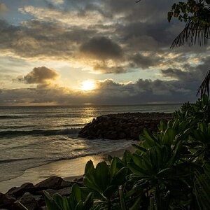
Here are a couple of architecture shots from a recent trip.
As always, comments welcome.
1.

IMG_4280a1 by breckmiller, on Flickr
2.

IMG_4305a by breckmiller, on Flickr
As always, comments welcome.
1.
IMG_4280a1 by breckmiller, on Flickr
2.
IMG_4305a by breckmiller, on Flickr


![[No title]](/data/xfmg/thumbnail/31/31034-2d8812b75c0bd23fdc2c885c24194e1f.jpg?1619734580)