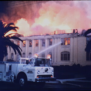
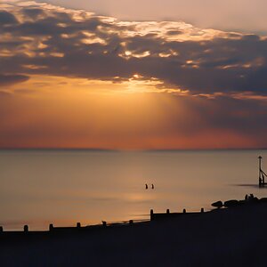
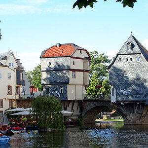
I'm with you on this one, I really like the color version. I think the color of the roof of the building and the booths really add something to the shot.
Personally, I prefer the color version. The B&W version has too much of an IR/unreal feel to it, and I take it that isn't what you were going for. I feel much more involved in the first.
Love the expression you've capture here! I can't decide between the color or black and white. I like the sort of IR feel, but the buildins really bring out the nice colors in the first. It could be fun to try selective coloring on the buildings only...but not sure how it would work out. Great composition and character in this one!!!
I prefer the color, the IR feel just isn't right in the black and white. When I first looked at it, I thought the b&w almost looked improperly metered or exposed or something like that. I know thats not the case, but thats what popped into my head. Other than that, I get a little more old time, rustic feel with the b&w that doesnt really strike me the way the color does.
I was attracted to the B&W conversion that a couple of you see as a little too IRish - I have to agree that it is bordering on the edge of unreal. In the old days, we could achieve this appearance from brightly lit scenes in the darkroom using certain grades/contrasts of paper and filters in front of the enlarging lens. What I don't like in this image is the high contrast effect the sand has...
And though I can usually let the color version go without a thought, here there seems to be a pastel-like art-deco feel to the image/lighting. So, I guess I'm still on the fence on this one.


![[No title]](/data/xfmg/thumbnail/33/33356-9cfc19255e84aab13c903f781a99cf9f.jpg?1619735920)
![[No title]](/data/xfmg/thumbnail/40/40287-4f839095000f74d779b90ed75df9dc62.jpg?1619739408)