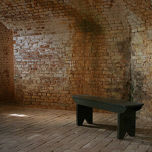
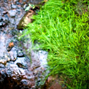
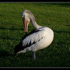
Great texture and tonal range. My only suggestion is to crop it more or less square and get rid of most of the upper right and lower left corners. I find them distracting, the upper right because it is very close and very out-of-focus; I'm not sure why the lower right is distracting. Alternatively, you could darken the upper right to make the softness less apparent.

")

![[No title]](/data/xfmg/thumbnail/34/34062-c0c9c0a752bc1af58237eff1ec850163.jpg?1619736259)
![[No title]](/data/xfmg/thumbnail/1/1592-cfae4a7ea791f96c6e2d03484be2e454.jpg?1619729144)