I'd like to hear what you all think of these, be honest. I know that there are some points that could use work, but I'd like to hear each different opinion.
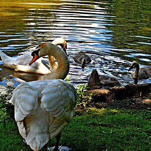
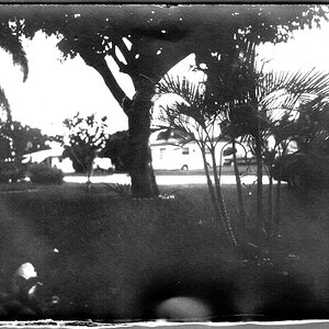
A nice collection. #1 would have more visual impact for me if the tree weren't quite so dead center. Beautiful image, a little cropping could fix that. Very stark and dramatic, my kinda shot! #2 - almost there; I want more texture in the boards to go with the shadows and angles...ALMOST there, but it's not quite grabbing me. #3 seems a little falt, but that could be my monitor, too, although I like the image. I like your swan: maybe a half stop or so off in exposure? Again, could be my monitor, but I'd like a little more detail in the beak. If it's there, it's just my old monitor telling lies.
Nice work, overall! #1 is my fave despite the composition.


![[No title]](/data/xfmg/thumbnail/37/37116-fdf3127b1d8834c25461dd2d201c031c.jpg?1619737883)
![[No title]](/data/xfmg/thumbnail/37/37115-e2d49d984453c62a2a20cf741e3d6679.jpg?1619737883)