AMOMENT
TPF Noob!
- Joined
- Sep 27, 2011
- Messages
- 701
- Reaction score
- 48
- Location
- NY
- Can others edit my Photos
- Photos OK to edit
Hey, guys/gals...hope everyone is well. I'm still at this and still loving it. Here are a few of my latest. How are my doing?
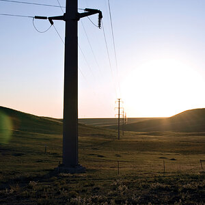
1.
14 by Jadelm, on Flickr
2.
19 by Jadelm, on Flickr
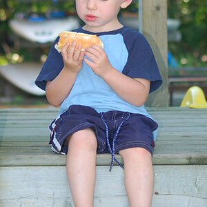
3. (Bad Crop I know)
3 by Jadelm, on Flickr
4.
2 by Jadelm, on Flickr
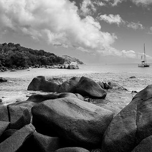
5.
2 by Jadelm, on Flickr
6.
87 by Jadelm, on Flickr
7.
50 by Jadelm, on Flickr
8.
51 by Jadelm, on Flickr
9.
63 by Jadelm, on Flickr
10.
59 by Jadelm, on Flickr
11.
55 by Jadelm, on Flickr
1.
14 by Jadelm, on Flickr
2.
19 by Jadelm, on Flickr
3. (Bad Crop I know)
3 by Jadelm, on Flickr
4.
2 by Jadelm, on Flickr
5.
2 by Jadelm, on Flickr
6.
87 by Jadelm, on Flickr
7.
50 by Jadelm, on Flickr
8.
51 by Jadelm, on Flickr
9.
63 by Jadelm, on Flickr
10.
59 by Jadelm, on Flickr
11.
55 by Jadelm, on Flickr
![[No title]](/data/xfmg/thumbnail/32/32633-d833b07b761b12c973eb0d27505935d4.jpg?1619735553)


![[No title]](/data/xfmg/thumbnail/37/37127-bf1c0cde30f216dbd2804a0e700d6433.jpg?1619737884)
![[No title]](/data/xfmg/thumbnail/41/41800-9fad93555f178073cae2f303c5ef4e23.jpg?1619739897)
![[No title]](/data/xfmg/thumbnail/32/32716-bd7f0a0030263f160d995f8547043458.jpg?1619735621)
![[No title]](/data/xfmg/thumbnail/32/32631-60d0db057ee085953a0921e337396654.jpg?1619735552)
![[No title]](/data/xfmg/thumbnail/32/32720-b9edc2f3e7f95d97aa6561cf835b47c8.jpg?1619735626)