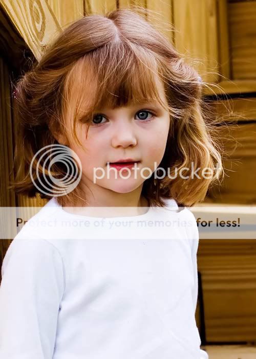
I would love some feedback on this photo. I've been trying to work on exposure lately. How did I do? What's good? What's not so good? What's downright awful? Thanks!!
Clearly a keeper.
The subject really engages the viewer.
Compo nice (altho if there is a little more frame on her right, that would be better)
Sharpness is looks right on. Hair detail and background is terrific.
It needs a little touchup for the small magenta color cast, lighten up eyes a little and a little work on the shirt to tone it down.
Some work on the full-res original and this will be a treasure.
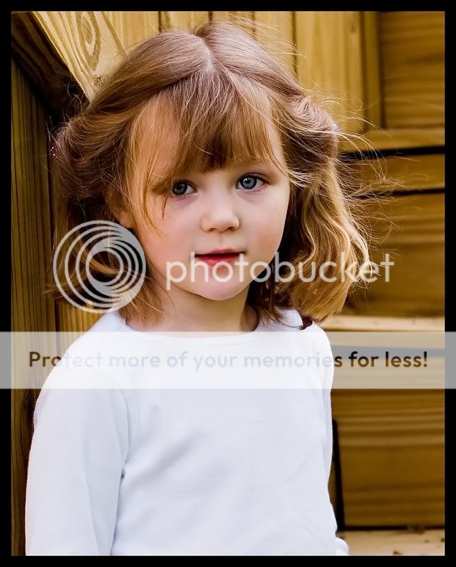
(as a personal bias I would crop this to fit in 8 x 10 [crop to 7.75 x 9.75 and add a .25 inch frame] to remove some of the shirt)
That magenta cast remark may be wrong.
I tried playing with it some and am not making it any better.
There is something minor wrong with the color but I am at a loss right now.
I was able to achieve roughly the same result by isolating the face, then applying a hue/saturation mask, then selectively increasing both the hue and saturation for the yellow channel by about 15 pixels each. But I am definitely not smarter when it comes to touching up color issues.
What a great capture, and I agree that her expression is so engaging. Even though the shirt is a big bright it really doesn't detract from her face. I think you've done a very nice job with this one!
I love pictures that aren't overly cluttered. This one is great with just 3 elements- the face, the white shirt and the background wood. I really like it.
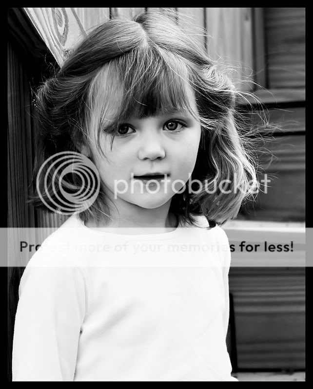
I prefer the colour shot. The contrast on the b&w is a bit high. You lose some detail. Exposure seems spot on. I personally don't mind there being more background on the right of her. Your cropped image is an improvement as less of the shirt is shown. The eye is drawn to the lightest portion of an image first. We want to focus on her sweet little face! Nice shot.


![[No title]](/data/xfmg/thumbnail/33/33339-c5b461af62b32f6b6529f1b334d818ba.jpg?1619735909)