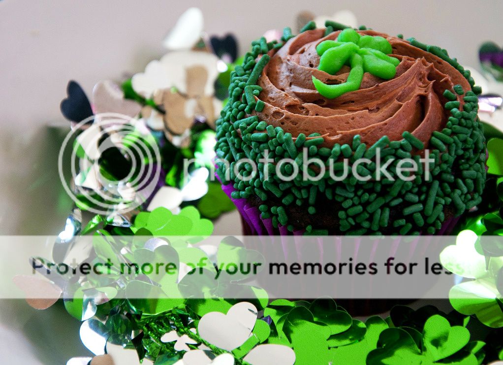
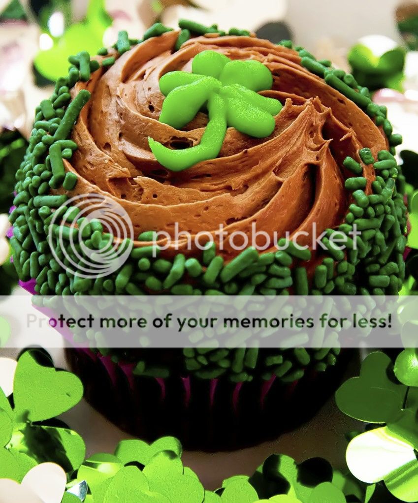
While the cupcake looks delicious, there are a couple of things about the picture that aren't as tasty.
When I look at this picture, my eye is drawn to the top of the cupcake and yet that part is jammed in the upper right quadrant. Why is it there?
Why is the picture cropped to a non-standard size and all that space is left on the left side while the cupcake is pushed over to the right?
I cropped it this way because whenever I center a photo people jump all over my case about it, so I was trying to make it more interesting by using the rule of thirds. Here is another that is more centered...
It's awfully crammed into the frame in the above crop...needs a slight bit more space in which to "exist". BEAUTIFUL cupcake by the way--looks simply delicious!
Unfortunately the people who ranted about 'rule of thirds' probably didn't know any more than to look at that as a 'rule'.
The real issue is that you need to understand how people see things and then from that you can decide where to place the centers of interest in a photo.
When someone looks at a picture, if the center of interest, the spot their eyes are drawn to, is in the center, their natural impulse is to look for its symmetry and, if it isn't symmetrical, to look around to try to understand why it is in the center.
On the other hand, if the COI is not symmetrical, people want a clue how to look at it, approach it. Pushing something against the edge makes it look squeezed in, less important and leaves lots of unimportant space so the best place to put the COI is somewhere between the center and the edge - hence the thirds 'rule'.
I think the cupcake looks better this way. The top, the COI, is at the thirds, there is a natural leading line drawing the eye to the top and it isn't squashed against the edge.
I darkened a light corner so the views don't slide out there and it looks good. Nice and sharp and very edible.
You might darken the really bright clovers (?) so they don't distract but it's still fne this way.
The_Traveler makes some great points, and his cloning work in Photoshop illustrates what I was talking about in regard to the image needing MORE SPACE above the cupcake. The_Traveler's retouched image with the big red arrow--now that looks balanced and good! There is enough space above the cupcake for it to have its own "space"...with too little space above the frosting, the cupcake seemed crammed-in, and there was a weird visual tension...cloning in some extra canvas and creating more space got rid of that visual tension.
Thanks for taking the time and effort to do this, The_Traveler!


![[No title]](/data/xfmg/thumbnail/30/30993-7c6dca4375064e92f2ea6cbfabf9b59e.jpg?1619734556)
![[No title]](/data/xfmg/thumbnail/37/37657-01deca3769b38b716838942ccbfce66a.jpg?1619738172)