Ballerina

sarah_19_nz

No longer a newbie, moving up!
Joined
Apr 1, 2013
Messages
411
Reaction score
148
Location
New Zealand
Can others edit my Photos
Photos OK to edit
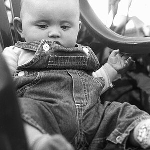
Thoughts and advice please. This is my youngest daughter. How would you have cropped this? I had plenty more background to work with, I don't think it looks quite right. I want the whole chair in and I know about rules of thirds etc but let me know what you would have done. Hows the lighting? Settings? CHeers!

$impromptu3forum.jpg$impromptu7forum.jpg
 
I think this needs simply "more space" around the chair and child. Which might be tricky to achieve for a number of mostly technical reasons associated with APS-C sensors, angle of view, and 9-foot backgrounds in home studios...

ANyway, the chair is very large compared to her, and the chair is kind of close to the edges of the frame on all sides, leading to a cramped feel. This aesthetic, of "living room furniture shown on studio seamless backdrop" is relatively new, and I have seen some good examples of it. What makes this trope work is having some of the "studio seamless" shown in the photo...that's not occurring here...the chair is just jammed into the picture area, with no space to breathe. The CHAIR is so,so big that it dominates the entire frame space.

You could take shot #2, and frame it square, and put a border around it. Might work best that way, square format, bordered. Or even...dare I say it, Instagrammed????????

Lighting is okay, I guess. I think the fill light is too strong though, and is actually casting a leg shadow on the chair, and also lighting up her ear on the left side. Basically, the chair leg shadows show two mights, fairly close in total power, sort of cross-lighting the set not with main and fill, but two dueling main lights. Just 'okay'. Getting rid of the fill light entirely, and having just ONE shadow direction would probably light this scene and her and her tutu in a better, more "arty" manner. JUst one guy's opinion though.
 
I think the first one is too centered. The second one is adorable. I love her little innocent look, and how she is off center in the chair. I like the color of the chair with the background.
 
I wanted to see what #2 looked like squared up a bit, and with some minor exposure and contrast changes, so I made a few slight changes. It could still use a border to enclose it.

$impromptu7_cropped.jpg

I brightened up her outfit a bit, and tried to make the underneath the chair part a bit darker, and thought the highlights on her legs nearest the main light were bordering on being over-exposed, so I recovered the highlights, but also adjusted the curves in the highlights, upper mid tones, and the lower tones, just to get the kind of studio-flash look I thought looked good for this shot.
 
good advice! thanks. I'm going to recrop these with more space around them I think. Didn't quite 'nail it' did I. I like your edit Derrel, brightening up the tutu works well. I have to keep working on my lighting, I find it really hard to figure it out, seems like no matter how hard I practice I still don't get it. One day I will have an AhHa! moment i'm sure :)
 

Most reactions

Back
Top