OP
OP
Trenton Romulox
TPF Noob!
- Joined
- Mar 10, 2007
- Messages
- 2,392
- Reaction score
- 0
- Location
- Maine
- Website
- www.jeremygrayphotography.com
- Can others edit my Photos
- Photos OK to edit
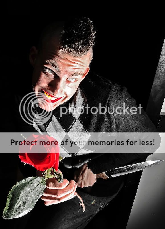
That's sick dude.
One thing I see is that you have the teeth going from yellow to white on flash side, but the lips remain constant red. Doesn't look right to me.
Yeah, that's the way it was before I did the lipstick and yellow teeth in PhotoShop though, 'cause I did that with an overlay paint, so the overall tones were the same before and after. I thought it was a bit off too, Kundalini, but it turns out that's just how the original shot looked, brightness wise. And I'm not sure I really dislike it a whole lot, the lips and teeth, because the shot has enough creepiness going for it, I think, that people won't notice the inconsistencies. But, I do agree with you, and I'm gonna look into this shot more in PhotoShop and see what I can work out. This is why I post here, to get good feedback like all of you, not just Kundalini, have given me. Much thanks guys.
Anyone else wanna chime in? The more opinions and viewpoints and tips, the better. :]