Beach Sunset

drdan

TPF Noob!
Joined
Feb 18, 2004
Messages
549
Reaction score
0
Location
Colorado Springs, CO
Website
thegoodsleepstore.com
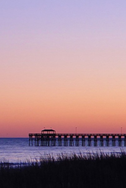
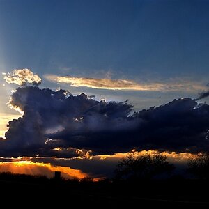
I took this at Myrtle Beach, SC in Dec 2005. I kept putting off editing it as I could not figure out where to go from here. I ran this through Neat Image as it had a little noise from the low light. I also had to use Unsharp Mask and boost the saturation and brightness slightly to keep the same look and colors as I resized it for posting. Other than that there is no other cropping or PS or manipulation of colors. I really like it but know it just doesn't quite make it, especially the dark sea oats and dunes in front. I can't figure out where to go with it.

I didn't have my tripod and took it with the timer and the camera balanced on the edge of a lifequard box. I didn't even have to straighten the horizon.:)

Any ideas? Anytime I try to change anything I don't like it as much.

Feel Free to manipulate and repost.

DSC08327re650.jpg
 
I really like the colors you captured. I tried a crop that still kept them in, but tried to emphasize the details of the dock. Hard to do with this image as a source, but hopefully you have enough rez on the original to at least make a good web image from. There may not be enough there to get a decent sized print though. I also did a layers adjustment and deepened the colors because the crop lost a bit of the intensity.

DSC08327re650-mod.jpg
 
It needs some of the negative space balancing I think... I tried a horizontal crop, a bit extreme perhaps, but it's another idea for you!

pier.jpg


Rob
 
Oh I like Rob's horizontal crop, I'm a big fan of that - it gives the idea of a panorama which this shot needs. The colours are beautiful. I'd give you more input but I don't think I'm in the same league as the guys critiquing here yet. Good luck with this one, it's definitely a keeper!
 
Maybe you could "steal" a moon from another photo (the sky must still be light blue but the moon already out) and place it in the upper left hand corner (not too high) of your original version? That would be cheating, all right, but I could imagine seeing the moon there. Just an idea.
Other than that I love the colour gradients in the sky and the water.
There is one tiny bit of beach at the bottom that show, but need not be there, therefore I might try a crop on that myself.
Ha, and a little "stolen" moon up there.... ;)
 
i think if you could straighten out the foreground that would make it more appealing. All the other lines in your photo are horizontal and then the grassy foreground goes on a slant, giving the image an unbalanced feel.

It can be done in CS2, think it might be the vanishing point tool, but im not sure
 
I liked the horizontal crop, and I saturated the colours a bit more, and smoothed out the sunset's natural gradient. Enjoy!

sunset.jpg
 
I love the panoramic version. I think that is about all it needs. the sharpeness of the dock is great and the colors are very soothing. its a nice serene setting I would say take the panaramic version and have it blown up to 12 inches tall by what ever the equivalent wide would be, and put a nice black frame around it thats it. (personally I stay away from painted frames and make all my frames from wood keeping them their natural color and just finishing them with a shellac or polyurethane. European Steamed Beach would lookgreat around this picture)

I do like the idea of there being a moon in the left, although I do not like the idea of manipulating a photo to that extent. Half the fun of photography is capturing the "perfect shot". If you just manipulate and cut and layer photos your not capturing anything you are just creating it.

My uncle waits all year for a certain time of one day to hike half way down a trail into the Grand Canyon so he can get a shot where the sun is perfectly behind this tree. If its cloudy that day, too bad, he needs to wait another year. That is the excitment of photography.
 
this is a beautiful image, I know that pier, is that surfside? I like the pano crop.
 

Most reactions

Back
Top