JeffieLove
No longer a newbie, moving up!
- Joined
- Feb 8, 2010
- Messages
- 1,601
- Reaction score
- 15
- Location
- Elkton, MD
- Can others edit my Photos
- Photos OK to edit
CC if ya want, but I'm probably going to post more than the "recommended 2 or 3" ")
IGNORE WATERMARK FOR CC PURPOSES PLEASE!!
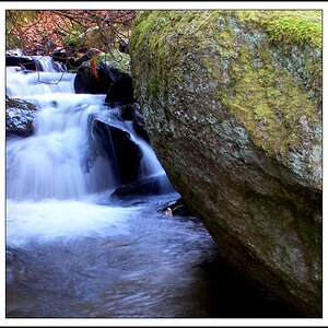
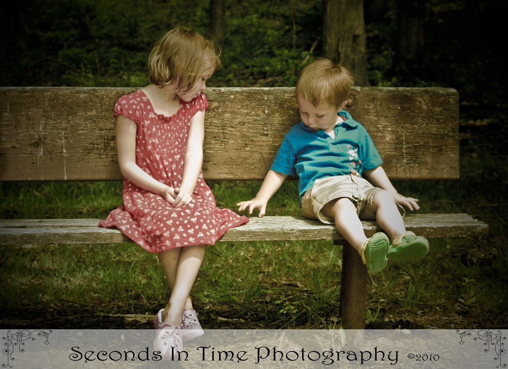
1.
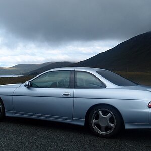
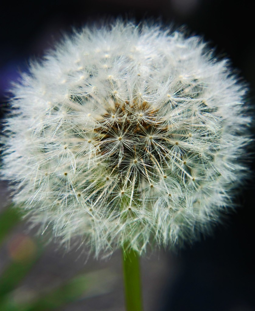
2.

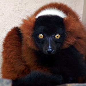
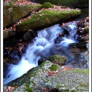
3.
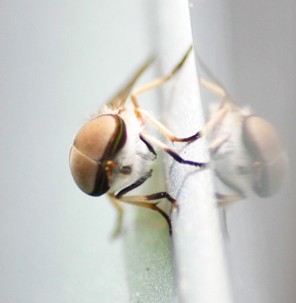
4.

5.

6.
IGNORE WATERMARK FOR CC PURPOSES PLEASE!!
1.
2.
3.
4.
5.
6.

 , so I saved you some.
![[No title]](/data/xfmg/thumbnail/41/41889-81d59d4994c91e71aaf805b05b133966.jpg?1619739933)