Before and After! How did I do?

NickLane

TPF Noob!
Joined
Jan 10, 2012
Messages
34
Reaction score
1
Can others edit my Photos
Photos NOT OK to edit
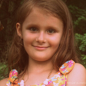
Here's the before and after! In my opinion they're both great, I believe the only thing that's better of the right is the clarity. What do you think?
(Make sure to view the full sizes! For some reason it looks different before you click it?)
$8226747143_7a571d1664.jpg$8226769687_d847861b1e.jpg
Full Sizes http://www.flickr.com/photos/90577806@N03/
 
Last edited:
That picture stayed in the oven too long.
 
She looks another 10 years older in the second shot. Well, maybe that's not a good analogy, since at her age she MIGHT, might mind you, wish to appear older. I'd say the second image adds another 100,000 miles to her...
 
The second looks creepy, I call retry! :)
You're right for some reason the way the photo is compressed on here it makes it look completely different than when you click it. Try that maybe? After finishing it in photoshop it did not come off that way ahaha
 
The first thing I thought was that the processing was bordering on making her look like a zombie, I thought that was a bit too harsh.
 
The first thing I thought was that the processing was bordering on making her look like a zombie, I thought that was a bit too harsh.
go to the full quality image link let me know if thats any different for some reaason im getting a weird color compression here too which does make her look like a zombie$8227922452_c99d3413de.jpg
 
There it looks under saturated.......maybe a monitor calibration is in order?
 
True, the browser/site is compressing it a little to make the blacks look even blacker in the thunbnail, but in the full version she's still somewhat overcooked. My brain immediately saw zombie at first because of the new hard edges, bright light eyes, desaturated skin, and overall HDR. Somewhere in the middle is where you want to be.

Have you tried making an edited layer above the original layer, then using the erase tool so the entire photo isn't being effected so dramatcially? it gives you much more artistic control and it won't flatten the overall image out and make it look like a painting.

The yellow tone change is cool, I like that color grade direction.
 
Nope, it looks just as bad in the full-size, just spread out over more space.
There is too much cyan and too much blue in the mid and highlights in the originals and you ahven't color corrected it well.
There is also too much dead on flash.

Since the OP hasn't been back I'm going to edit this.
The OP isn't looking at the image and seeing what is wrong in very specific terms.
Flat lighting caused by a flash can't be cured by this kind of contrast enhancement.
The color is way off of normal healthy skin and the first rule is to try and correct the color.
I have posted links to two successive edits below to show how I would have changed the color.
 
Last edited:
there is just something about it that is just not appealing to me. I cant put my finger on it though. keep up the practice
 

Most reactions

New Topics

Back
Top