That creepy guy sure started a rage in your other post! Did you see what's going on over there?
I like #1 here. I think the foreground bushes take away from the colors and church steeple on the other side though. I would crop the bottom off?
Listen to me giving advice when I'm getting hit hard on my horizon in Landscape section
Also like #1 best. Would crop some of bottom and close out the two taller twigs (center and right). The one on the right really bugs me that it's reaching the other side of the water.
Sorry that the other thread turned into somewhat a mess. It happens time to time. It would be nice if we just tried to read what you said "not going to happen".
Good eye
First one is the best, I think. It has something on the far shore to attract and anchor the eye.
But you need to watch the horizontals.
Things that should be horizontal, shouldn't be tilted unless there is an artistic reason.
Good eye
First one is the best, I think. It has something on the far shore to attract and anchor the eye.
But you need to watch the horizontals.
Things that should be horizontal, shouldn't be tilted unless there is an artistic reason.
Darn, pretty sure I "straightened" that one too! I probably made it worse. I have a really hard time using the straighten tool in Elements. Love your edit. I'm still learning most of the post processing stuff. Thanks for the link!
Good eye
First one is the best, I think. It has something on the far shore to attract and anchor the eye.
But you need to watch the horizontals.
Things that should be horizontal, shouldn't be tilted unless there is an artistic reason. View attachment 110192

")
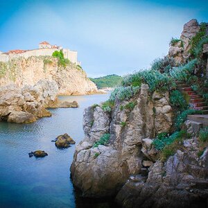
 but I'm not a fan of some of those buildings.

![[No title]](/data/xfmg/thumbnail/41/41818-fb8293ceb208cab396fce9a587bbe37b.jpg?1619739903)


![[No title]](/data/xfmg/thumbnail/38/38737-350089c7ae87f5c983c5362b9b78b671.jpg?1619738703)