Beginner, critiques/guidance wanted

Animaniac888

No longer a newbie, moving up!
Joined
Jun 27, 2012
Messages
199
Reaction score
23
Location
USA
Can others edit my Photos
Photos OK to edit
Just recently I got my first DSLR, after having used various cameras for a while and doing CG for a year. I'm familiar with basic composition rules(rule of thirds, etc.) and camera basics such as aperture, shutter speed, ISO, etc., but don't know much more than that. In a nutshell, I'm looking for general critiques and suggestions to help me improve.

1. $chessmen_by_animaniac888-d56hznj.jpg

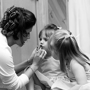
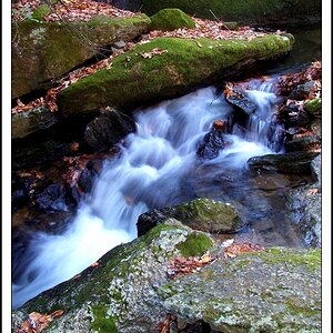
Don't have much else worth displaying yet, but I'd still like some feedback about this image.
 
It is OK. Little wavy board.

Send in more, one is hard to judge.
 
On the image you attached, it's a little blurry (to me) and I would have played around more with depth of field.

As far as shooting in general, if you want to get a feel for your new DSLR, take a few days and go around town, drive to a little place in the middle of nowhere and just shoot. Play with the settings, use a tripod, etc. You'll get a feel for it, I promise. It took me 4 years to get to the professional position I have now, and I love it, yet I still find myself learning new things every day and night.

You'll be well on your way in no time.

:cheers:
RSC

PS, what gear are you working with?
 
Thanks for the replies. I will post more images soon and take the critiques into consideration.

@RedStickChick: I think the blurriness is because the image is at a far lower resolution than its native resolution. I'll try sharpening it up. Could you please elaborate about the depth of field and what you would have done? Should it be shallower, or larger, or should there be a different focal point? Thanks in advance.

I'm working with a Nikon D5100. In the picture, the lens was a 18-55mm VR kit lens, but I also have a 55-300mm VR kit lens.

Here's a new picture:

2. $the_humble_bee_by_animaniac888-d55ddkg.jpg
 
Part of what makes an image interesting, is the ability of the viewer to discern a story. There are many other ways to make an image that viewers want to see, but story-telling is a powerful way to pull the viewer in.

In your example, the White King is isolated. It is not clear if that was because it was escaping a trap, or was in a checkmate position. Let's say it was... Then the next step would be to use lighting and depth of field to make a link between the King and the attacking piece.

In your image, the King piece is backlit, as are the other pieces. Attention is drawn to it because it is sharp, whereas the other pieces are somewhat blurred. If you could put a little fill light on the King piece, it would serve to spotlight that piece and make it more prominent.

The waviness of the board does not add to the image.

Especially with closeups like this one, you need to be very aware of any dust, stain and other detail that may end up distracting from the composition. If you ever shoot on glass or a reflective surface, you'd be amazed at the amount of stuff that the camera sees on a surface you were sure was perfectly clean.

The general suggestion here would be to think about what you want the viewer to see and feel. The arrange the scene, the lighting, and the camera perspective and settings to deliver that vision to the viewer. Ideally, you'll be using the clues of zones of sharpness, light direction and highlight/shadow to guide the viewer's eye to various parts of the composition you want them to see.

In another thread, it was mentioned that most of the great images have had a lot of preparation done prior to the image being taken, with the photographer being very aware of the light(s), the movement of the subject, and the selection of the camera settings to allow the image to occur.

In the last image you posted, we can see the bee, which was your intended subject, pretty clearly, but the sharpness and the bright tones of the flowers on which it is feeding are pulling the eyes away. The background is also relatively clear and brighter than your subject, so the eyes get pulled there too. In this situation, you'd want to have a narrow depth of field, centered on the bee, with a close enough framing that the flower is not competing with the bee for our attention. As well, unless the background is needed for providing context, is is better to see less of it.

The general rule is the brighter and sharper something is, the more it tends to attract our attention. If that's not the subject, then we've got some visual conflict going on.


I couldn't have said it better.

When I was referring to depth of field, my personal preference regarding focal point is to not have it right in front. I like to set it back a little or have it out of the way. The lighting in your chess picture is also a little weird (probably not the right word, sorry). Maybe try a little less back lighting and more from above?


And I actually didn't notice the bee in your second picture until I read about it in pgriz's post.
 

Most reactions

Back
Top