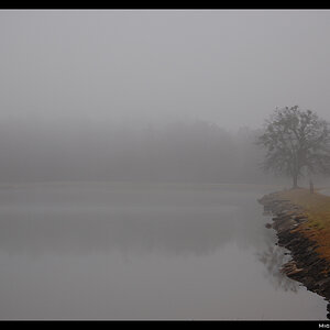
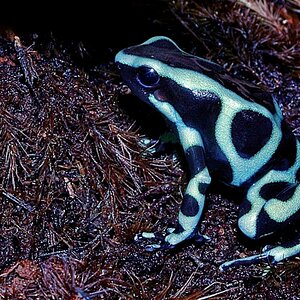
i loved the first. im personally fond of straight lines and 90 degree angles and S*&t like that. the picture makes me uneasy and i tend to cock my head to one side. any pictures good when that happens
The first one is great. It may be a trifle underexposed ergo dark in the shadowed bits but I think neccesarily so. And it benifits the composition. By far my favorite. The 2nd is too busy for me. To many conflicting lines. perhaps too abstract? I cant remember anything in the picture once a look away. #3 is nicely abstract. I like the rough weather beaten look of it. But unless its my monitor the lighting or develping seems patch in spots? or at least the contrast differs accross the middle.


![[No title]](/data/xfmg/thumbnail/31/31754-af76ae89cc75bd1855937374ff359efe.jpg?1619734992)


![[No title]](/data/xfmg/thumbnail/32/32637-865ab9beec7e00237b64e4fcb8fe947f.jpg?1619735555)
![[No title]](/data/xfmg/thumbnail/36/36657-3774cdd7ebbafa5ccac2741386b9949a.jpg?1619737675)