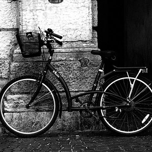
I will admit first hand that I am no pro when it comes to black and white but, I can say that this image lacks depth. It needs some contrast bumps. It is a tad bit blurry as well so I wold use some method of sharpening.
The photo is too small to give accurate comments about. Its not sharp but rather fuzzy. Is it full frame or has it been cropped? It does look like an HDR that was converted to B&W but with no further work. It looks kind of flat and could have used some Gamma Correction. Any good HDR image makes a great B&W -- every time.
I will admit first hand that I am no pro when it comes to black and white but, I can say that this image lacks depth. It needs some contrast bumps. It is a tad bit blurry as well so I wold use some method of sharpening.
I appreciate the feedback... I took a closer look at the full resolution photo and I think the focus was sharp... This photo was uploaded was loaded from a resized file on my iPhone, so perhaps that resulted in a lack of sharpness. Do you think that contrast bumps would result in a greater sense of depth?
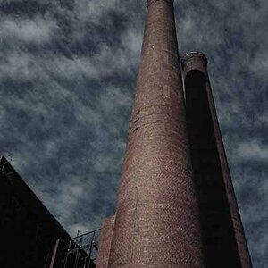
This photo was certainly a 3 exposure HDR image... +2, 0, -2... The timing was unfortunate though... What was a beautiful afternoon quickly turned into a dreary overcast twilight... The original HDR image had an awful blue/grey cast, so I decided to go B&W... Thanks for the feedback.


![[No title]](/data/xfmg/thumbnail/32/32632-476f3d925401f13cffe1cc2b41945614.jpg?1619735553)

![[No title]](/data/xfmg/thumbnail/39/39470-ad2036a502fde3b73f73e2b45e674866.jpg?1619739042)