"black bridge"

bnz506

TPF Noob!
Joined
Dec 22, 2006
Messages
461
Reaction score
0
Location
Brooklyn, NY
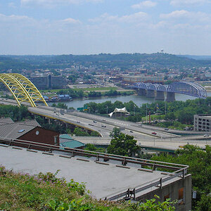
Yes it doesn’t look black here but on the sides it does :) . I havent been to this bridge in 8 years. We used to hang out here when we were teens. I remember being scared of it my first time because I couldnt swim and if I fell through the tracks into the water it would really suck.

Im on vacation in WI right now and this is the first time ive been able to get online in a few weeks. Ill post some more pictures when I get back home on the 25th.

blackbridgenr7.jpg
 
I like the angle and the composition. However, I think the graffiti kind of messes it up. It draws the eyes to just the beams instead of the converging lines.
 
With the sky washed out (or overcast) like it is, I think converting into B&W would make this much better. I agree that cloning out the graffiti would help as well.
 
With the sky washed out (or overcast) like it is, I think converting into B&W would make this much better. I agree that cloning out the graffiti would help as well.

Took words out my mouth try a b&w and getting rid of that graffiti
 
I like your shot here, I realize you are not asking for C&C but I still like it.


Color version.
 
I like the color version much better and see no advantage to going B+W with this piece. I also like the grafitti in the first and see no reason to remove it / hide it, it is there as part of the history of this structure letting me know that teens still hang out at this site. Yes I like the first image a lot...Nice!
 
Interesting, I think I prefer the B&W version however I think the graffiti should stay...for some reason I've always felt that 'older & weathered' structures stand out a little more when they have some modern additions to them...not that I'm saying we should all add graffiti to everything but the shots I see of buildings and such always stand out a little more when they have 'monikers of time past'.

My ramblings probably make no sense :)

Regards,
Peter Witham
 
For me...Had the sky been defined with clouds I would have gone with the B+W as an optional look. As it is, all that white space just takes away from the structure. Just my .02:)
 
I like this a lot! :thumbup:
I recognize the face, but didn't you used to have a different name? Of course, there is the additional possibility that my memory has finally blown a main fuse...:)
 
I actually love the grafiti, maybye contrast is just whats missing in the color version, (if anything)

Cool shot I like it....
 

Most reactions

New Topics

Back
Top