skyonfire
TPF Noob!
- Joined
- Jul 4, 2006
- Messages
- 522
- Reaction score
- 0
- Location
- Northern Kentucky
- Can others edit my Photos
- Photos OK to edit
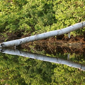
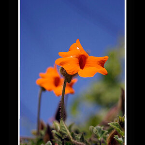
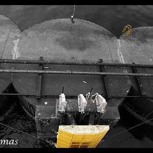
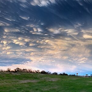
Hey all.. these are from a set I took last week.As always C&C welcome..
1)

2)

3)

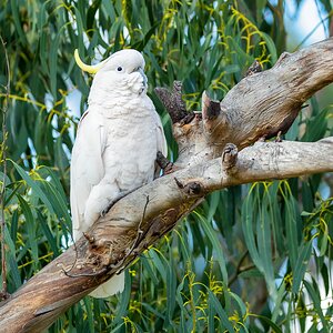
1)
2)
3)