Boudoir for C&C

indioli

TPF Noob!
Joined
Jul 24, 2011
Messages
95
Reaction score
19
Location
France
Website
www.indioliphotography.co.uk
Can others edit my Photos
Photos OK to edit
Hey,
These are my first sexy shots that I've done of someone other than me, and C&C would be greatly appreciated.
Thanks!

1
boudoir-1.jpg

2
boudoir-3.jpg

3
boudoir-4.jpg

4
boudoir-10.jpg

5
boudoir-7.jpg
 
#1 is the best idea but the lighting is not great, lovely butt, but i would want it to look symetrical if you know what i mean
 
Yes I do know what you mean, but hadn't noticed that before.
I intentionally darkened it to make it more 'mysterious'. Maybe I should start over with that one....
 
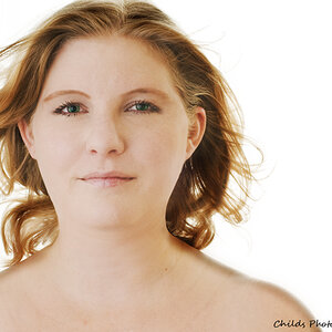
I agree the #1 is the best and that a little more symmetry would be good. Not a fan at all of #2. I feel like white background is too light and unnatural looking especially up around the face. I think a feather into the white would maybe help this a lot. #3 for this model is just not a flattering pose IMO. I like #5 overall but the contrast of the hair in the bottom left to the white just looks unnatural there. I don't see the contrast issue anywhere else in #5 just in the bottom left. Oh and that little bit of the finger cut off on the right bothers me a little too. I like the composition of the shot in #1 with the sheet.
 
1. has great potential, but the extreme contrast isn't doing you any favors. The wrinkly sheet is pulling my eye hard and REALLY detracts. So does the giant black spot in the crack of her butt. I don't know what your original looks like, but I think probably it has a lot of potential. Ease off the contrast a bit, get some light into those black areas.

2.That... well... I don't know what to say. I am sorry.

3. Your contrast on the hair is going to draw the viewer's eye right to that solid black spot of hair to the upper right side of the image. . The lack of detail in the hair is almost making it look like a wig.
Overall not so bad.
4. It's an adorable idea, but the lens distortion just makes her look like GIANT feet.
5.Your editing leaves her legs just floating in thin air instead of leaning against something. The focus point seems to be her undies, not the eyes. Your editing is showing on the white background rather poorly.
 

Most reactions

Back
Top