brownie men shoot v3

Alexandtheng

TPF Noob!
Joined
Aug 12, 2013
Messages
80
Reaction score
18
Location
Singapore
Can others edit my Photos
Photos NOT OK to edit
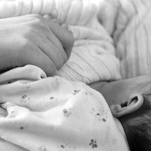
how's it now? any C & C? i think its more relevant to what they are trying to go for. thanks for all the input thus far!


I don't know exactly what you're trying to achieve so my comments may be off, but...

The lighting seems really nice.

First second and last picture, seems like the brownies are not that well arranged for a food photo.

Last picture seems like I see way too much plate... and not enough food... too low, possibly.
 
first n second photo was supposed to b a little messy, just a huge plate of brownie.

last pic i know what u mean, but if i were to raise the angle the horizon would be way too high as the plate was very far from the edge and i did not have a longer lens:)

the is the site im working for The Brownie Men

this was my first attempt
http://www.thephotoforum.com/forum/...hotoshoot-i-did-online-bakery-c-c-please.html

second attempt
http://www.thephotoforum.com/forum/...brownie-advertisment-re-boot-need-advice.html

im hoping there has been improvement:)
 
This attempt is much better than the first couple. I think you're doing a good job of selling that these brownies are for a high end client. Personally, I like that you're focusing on the people more than the brownies, and it seems to go with how you're describing the product. I like the plates full of brownies. I think that is a good solution to the problem you were having with the product previously. You are still suffering from the problem that the brownies are ugly.
 
Personally, I like that you're focusing on the people more than the brownies

Well because brownies don't look all that appealing you have to focus on the people. The problem is the people look like they absolutely do not want to eat the brownies.

All the ones with the woman look like she wants to spit the brownie out and the guy in this one looks like he is asleep. The plates of brownies them selves don't look appealing because the brownies don't look tasty. Perhaps the best one is the one with the guys head cut off because you snot actually see the expression on his face.

I know it's not your product but trying to sell crappy looking brownies as a "classy" product just does NOT work.
 
I like that #2 has a well dressed "classy" person in it but the brownies are kept the focus. A few things though, better to have one brownie so it pops against the white plate. Make it classy looking by drizzling some chocolate around it (but not on it). You know how fancy restaurants do a little "presentation" of their desserts. Maybe shoot down onto the brownie a little more. I get that there is a bowtie in the logo and on the person but I think it would be better to show less person and more brownie. Plus the crop makes me think he's going to miss his head. Also, the way he is holding the fork is not classy at all. Try some with his hands not on the table and a white apron tucked into his suit. Try one with him cutting the brownie with high class silverware. As if he is cutting a fillet mignon.

The last two are nice product shots but more for website backgrounds than attention grabbing.

I have to say I like the direction its going and much nicer than the previous photos.
 
I'm sorry, but these are even less appealing (in terms of making me want to buy the product) then your earlier series. Looking at the first two, the expression and tension his body, especially his hands reminds me of a child who's just been told that he can't play with his new toy until he finishes a plate of brussel sprouts!

The lighting is very good, but I don't think it's appropriate. Brownies, even classy brownies, should be happy food; this is very somber, subdued lighting. Think high key, smiles, stuff like that.

I reiterate my earlier comment - this company NEEDS to hire a real artistic/creative director who can give you some ideas. You've clearly got the photography down, but the artistic side of it? Not so much.
 
For a high end brownie they are certainly inconsistent on the way they are cut. Looks like they just cut them with a dull butter knife without even trying to make them the same size (in all especially # 3 which the top one looks like it was ripped off and not cut)

# 1 - I like and I assumed he was looking down. But as some mention he looks asleep too. But his clinched fists make it look like he may be on a mission. Fork looks nice not the thin thing used before.

# 4 - what is that blob there with brown dots on it? It being the whitist thing keeps my eyes going to it.

The plates are really nice but I think they edges go up too high/too deep and it hides the brownies too much especially # 1 & 2.


my 2 unprofessional cents worth .. but I like them
 
those last three are great. I dont like the first at all, it appears his eys are closed, but i THINK he's looking down.
 

Most reactions

New Topics

Back
Top